Combination of kitchen and floor colors. Color combinations in the kitchen interior - basic rules and individual solutions
The importance of color in the interior is difficult to overestimate, because the colors around us affect not only our mood, but also our physical well-being. A successful combination of colors in the kitchen interior is the key to comfort, coziness, excellent mood, excellent appetite, excellent digestion, emotional communication and readiness for culinary exploits. The ability to correctly use colors in interior design is a real art, which not everyone can master. The choice of a specific color palette depends on many objective and subjective factors: the specifics and purpose of the room, the character, temperament, age, lifestyle of the people living in it and, of course, the emotional effect what you want to achieve.
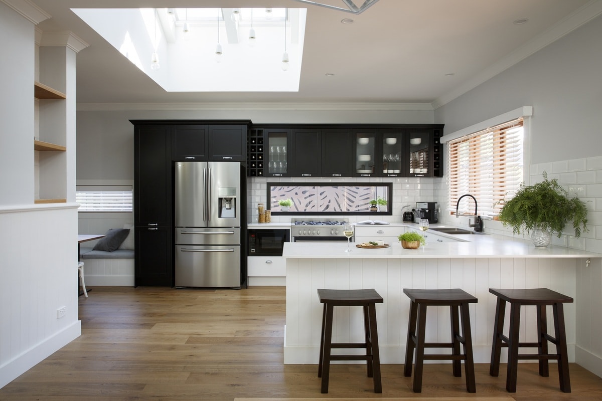
The bright and rich shades used in this interior will charge you with vigor and positivity for the whole day.
The color factor in kitchen design
Any designer knows perfectly well that color is one of the most effective tools for working with space. Of course, playing with colors is unlikely to compare with redevelopment, but still, with the right approach, using color you can correct the not very successful geometry of the room. By operating with cold and warm, dark and light colors, you can create the most unpredictable illusions.
Why do women love to wear dark clothes so much? Because dark colors make you look slimmer and hide volume, while light colors, on the contrary, make you look fuller, add volume, and expand. The same principles work in the interior. So, you can visually increase the height of the room by contrasting a light, light top with a dark and heavier bottom. But all you have to do is swap these colors and the effect will be radically opposite - the ceilings will noticeably “squat”. In a similar way, you can “push apart” the walls or, on the contrary, narrow the room. Therefore, in the interior small rooms It is preferable to use light pastel colors, leaving bright colors for accentuation. Conversely, to make a spacious room more comfortable and cozy, it is recommended to actively use bright, rich, deep shades, especially since they are welcome in the interior of the kitchen.

Yellow and blue colors for a marine-style kitchen are a win-win option from an aesthetic point of view
In general, there are no “right” and “wrong” colors in the kitchen interior and there simply cannot be. Everything that does not contradict your ideas about beauty and harmony is appropriate. When choosing a specific color, it is extremely important to take into account its properties and try to predict the effect it will create in the room. Cold colors (shades of blue, blue, green and gray) reduce appetite, relax, calm, and give a feeling of freshness and coolness. Warm colors (red, yellow and their shades) increase appetite, improve digestion, energize, invigorate, encourage action, and warm up.
Color combination in the kitchen interior: selecting the color scheme
The kitchen interior can be chromatic (having color tone) or achromatic (white, gray, black). Purely achromatic kitchen interiors are extremely rare, since it is generally accepted that such an environment can plunge one into apathy, depression and give rise to color hunger. This can be easily corrected by creating a dynamic achromatic pattern, for example, by staggering black and white tiles on the kitchen floor. Another option is to dilute the achromaticity with a bright, catchy contrasting accent.

Bright contrasting furnishings look good against the achromatic background of this kitchen
In chromatic interiors, the color scheme is a combination of many shades. Having decided on the basic tone, you should carefully consider possible options combinations of colors to create a harmonious environment for the “first violin”, on which the strength and depth of its sound will depend. Working with the color wheel, which consists of primary, complementary and auxiliary colors, designers develop countless color schemes, but all of them can be summed up under four main groups: monochrome color schemes, adjacent (analogous), contrasting (complementary) and triadic color schemes.

One of the most common kitchen design options is a combination of two colors, with preference given to light beige
Monochrome kitchens
Monochromatic or single-color color schemes involve using different shades of the same color in the interior. All the necessary effects are achieved by different intensities of one base color. Moreover, the more shades are used in the interior, the more interesting the result will be. This combination is considered the softest; it brings calm and tranquility to the interior, although there are exceptions to the rule. Monochrome does not mean monotonous and boring. Not at all. By wisely choosing shades and textured ensembles for a monochrome room, you can achieve an effect no less stunning than with a multi-color or contrasting palette. To rhythmically diversify the design and give the room “depth”, you can safely dilute monochrome combination flowers in white. An excellent alternative to white is silver, which is actively used in design. glamorous interiors. In small quantities, black is acceptable as a contrasting accent.

The widespread prejudice against lilac does not prevent designers from creating very attractive interiors in this color
To prevent a monochrome interior from looking too monotonous and boring, use the little tricks that professional decorators use:
- Maintain chain of command
To create a monochrome interior, you just need to decide on the main color, for which your favorite color is ideal, select three shades for it and use their combinations in the design of the kitchen. To give the interior a harmonious and professional look, one of the shades must certainly become dominant, and the other two auxiliary, complementing the main one.

If you use it to decorate your kitchen different shades orange, the result will be a bright, cheerful and sunny interior
- Use several shades of the base color
This will not only make the color scheme of the monochrome kitchen interior more interesting and varied, but will also help to zone the room into functional zones, visually correct layout deficiencies and create a certain rhythmic design in the room. For example, for a kitchen in a marine style, you can safely choose shades from sky blue and azure to royal blue and indigo.

Even modern styles will be filled with homely warmth and comfort if you choose a beige color scheme for them
- Combine different textures in the interior
The easiest way to complicate a monochrome kitchen interior is to use materials with different textures. The brightest textural contrast is created by a combination of glossy and matte surfaces: smooth and embossed wallpaper, wood and ceramics, glass mosaic and matte tiles.

A monochrome lavender kitchen looks stylish, restrained and at the same time luxurious
- Use contrasting accents
Small islands of color – bright contrasting accents – will help to “revive” a monochromatic interior. Sometimes just one large contrasting object or a couple of small catchy details are enough to make a monochrome environment “play and smile.”
Related colors in the kitchen interior
Analogue or adjacent color schemes use two or more colors that are color wheel located next to each other: yellow and orange, green and blue. As a rule, one of the colors is dominant, and the other is used for accentuation. This scheme allows you to create a harmonious, relaxing atmosphere.

The adjacent color scheme not only emphasizes decorative possibilities each of them, but also creates a relaxed atmosphere
Contrasting kitchens
A contrasting or complementary color scheme uses shades that are opposite on the color spectrum, such as blue and orange. At the same time, the main color in the interior is balanced with a contrasting one. Depending on the depth of contrast and intensity of the base color, the combination will be either active or calm. Furniture in contrasting interior The kitchen should be darker in tone than the walls, but lighter than the floor. Contrasting kitchens look stylish and impressive, but such an environment quickly becomes boring and boring, so it is advisable to limit the contrast to details that, if desired, can be easily replaced, completely changing the character and mood of the room.

Not many people decide to use bold contrasts in the kitchen interior, but daredevils really get unique interior
Three-color kitchens
A triadic color palette combines three colors that are located equidistant from each other on the color wheel. This combination creates a very bright, impressive effect. Having chosen a triadic scheme to decorate your kitchen, it is advisable to adhere to the principle of the predominance of one of the colors, and use the rest for accentuation.
Successful color combinations: finding harmony on the color wheel
Eugene Delacroix, a 19th-century French artist, was the first to depict a color triangle, the vertices of which indicate the primary colors (red, blue and yellow), and the edges indicate additional colors (orange, violet and green), which are formed by mixing primary colors (for example, blue and yellow gives green). The color wheel also contains six auxiliary or transitional colors, which are obtained by mixing the primary color with an additional one (green and yellow produce light green). In adjacent quarters there are related and contrasting colors: warm yellow-green and yellow-red and cold blue-red and blue-green. When rotated, the edge of the triangle indicates the result of mixing tones that correspond to its vertices.

The color wheel and triangle will help you select and combine colors for your future interior
- The colors located at the vertices of an equilateral triangle inscribed in the color wheel get along well with each other. Any combination of colors that is obtained by rotating such a triangle inside a circle will be harmonious.
- In accordance with the law of color harmony, colors located opposite each other are ideally combined. Blue goes well with orange, purple with yellow, and red with green.
- Neutral colors, from bluish-gray to ocher-brown, being something between the three primary colors, contain all the colors of the solar spectrum, and therefore interact harmoniously with absolutely all the colors of the spectrum.
- To enliven and diversify an interior in which there are two related and contrasting colors, inclusions of similar colors, darker or more light colors.
- In order not to overload the multi-colored interior, it is recommended to use no more than five colors and shades in one room.

Bright colors in the interior are ideal for cheerful, cheerful people, as well as for families with small children
- The saturation of color largely depends on the texture of objects. Glossy shiny surfaces enhance the brightness, intensity and depth of color, while embossed and matte surfaces, on the contrary, soften and mute the colors.
- Decorative elements in the interior play the role of accents, so they should be the brightest.
- The deepest and darkest color in the kitchen interior should be the color of the floor, and the lightest and lightest color should be the ceiling. The color of the furniture should be lighter and lighter than the floor, but darker than the walls.
- Despite the fact that a combination of red, orange and pink is considered a complete bad manners and an absolute taboo in color design, designers often decide on such a union, achieving stunningly beautiful and harmonious solutions. This suggests the conclusion that incompatible colors do not exist. The secret to a successful combination of colors in the interior is the ability to choose the right shades.
Photo examples of colored kitchens

The combination of light green and orange in the kitchen interior will remind you of warm sunny summer days

Shades of blue are not often found in kitchens as a background, but they successfully cope with their function, shifting the emphasis to brighter furnishings

The bright spontaneity and frivolity of the background of this kitchen is compensated by a restrained and calm color kitchen furniture

The very calm and restrained primary colors of this kitchen could be its drawback, however bright accents completely changed the impression

Yellow and green colors, complemented by bright prints on the facades, create a feeling of summer freshness in this modern kitchen

Achromatic kitchen is a design option often found in spacious apartments in big cities.

Set the color of baked milk on the background blue walls- one of the best options for decorating a kitchen in rustic style

The combination of bright red and gray-silver in the kitchen interior invigorates and inspires confidence and optimism.

The bold combination of red and blue creates a positive impression, which is enhanced by the clever use of natural lighting.

Strict forms and traditional contrasting colors of this interior become more attractive near bright decorative elements

Heavy maroon color goes well with white, creating an elegant and respectable atmosphere in the kitchen

Such abundance bright colors at first glance it looks very attractive and cute, but can quickly get boring

A bright accent wall combined with a huge window allows you to make the most of natural light.

A small amount of black emphasizes the depth of the main color of the interior - white, creating a feeling of radiant purity.

Another kitchen design option shows the advantages of a combination of light shades of light green and beige

Achromatic kitchen, flooded sunlight, will sparkle with new colors and shades, which is what the emphasis is on in this interior

Accent wall in the interior of an achromatic black and white kitchen, it not only dilutes the austere atmosphere, but also emphasizes the lighting features of the room
When developing the design of an apartment or room, special attention should be paid to color, since it can not only visually enlarge or refresh the room, but also has a certain psychological influence per person. The science of color therapy originated a long time ago and has even helped cure seriously ill patients! We will not go beyond the limits of the possible, but will simply pay attention to how the colors of the interior affect a person. As an example, let's take a closer look at the kitchen, the place where each of us spends quite a lot of time. It has been proven that the color design of a kitchen can influence a person’s mood, behavior, way of thinking and even appetite. Which, on the one hand, is not so surprising - after all, when a person is irritated, his head begins to hurt, and, on the contrary, to improve our mood, we only need to imitate a smile.
Kitchen color combinations that will inspire you (photo)
Color combination in the kitchen interior - important point when developing a design. To create a harmonious and attractive style, maximum quantity the colors that may be present in it should not exceed five. As a rule, rich and bright shades are typical for the smallest interior details; for larger items it is better to use muted and soft tones.
But, adhering to this rule, you should not make the interior monotonous, that is, use only one color. Rest assured, you will quickly get bored with this design, and it is possible that everything will have to be redone again.

Designers divide the combination of colors in the interior into three types - monochromatic compatibility, mixed And contrasting:
If you are a fan of monochromatic combinations, then you should choose one color for the kitchen, but in several shades. From this perspective, kitchens are designed to create an ideal environment and relaxing time.
Contrasting combinations should be chosen to create elegant interiors. It is perfect for a dining room or living room combined with a kitchen area.
A mixed color combination in the interior means using the purest color as the main color, rather than a tint.
When creating your own individual kitchen style, avoid unnecessary diversity, otherwise the interior may turn out boring and quite monotonous. When planning a color scheme, you need to consider which side the kitchen is located. For the south side, use cool shades, such as blue. Perfect for the north side warm colors– beige, yellow, red and others.
Red color is a symbol of love and good luck
The color red and its shades will help energize you and get rid of drowsiness and fatigue. It is believed that this color can have the strongest influence on a person. But in addition to relieving depression and the ability to warm, its excess in the interior can lead to irritation and even rage.
It is best to add a few bright accents - such as a painting, or pillows on the sofa, seasoning them with small accessories, such as a vase or figurine. All this will give you a surge of new strength and increased mental performance.
It won’t look bad in this color scheme personal account, since green stimulates human mental activity.
Green and its many shades (juicy lime, bright light green, light pistachio or rich olive) give the interior a natural freshness, charge the room and everyone in it with positive energy. Cool shades of green can be combined with brown, gray and white, while its warm shades harmonize with beige, chocolate and yellow.


White - harmonizes perfectly with all shades of green. Against its background, all colors look more saturated and bright

Green color in the kitchen interior can act both as the main background and as an auxiliary color - in the form of decor. For example, above work area can you post it beautiful apron emerald color, order a light green chandelier, select fabrics and decorative elements in these tones. You can complete the composition using beautiful plants, planted in pots.
Finding the right shade of green for yourself is not so easy. This is due to the incredibly wide color palette, from delicate "jade" to deep "khaki". The range of green spectrum includes such amazing shades as: lime, citrus, pistachio, emerald, herbal, sea, etc.


A rather original solution to refresh your kitchen interior is to install LED lighting
Kitchen design in green is one of the most popular and in demand today. By combining it with other shades you will get an unobtrusive interior that can calm and relax, since green has a beneficial effect on state of mind person.
Juicy and fresh, it looks perfect in glamorous kitchen interiors focused on... better half humanity. Such a bright color can cause positive emotions, improve mood and evoke thoughts of warm, sunny summer days.


Blue is the color of calm and serenity
Blue is considered the most delicate and calm color, which induces light, airy thoughts and brings back memories of the sea. In addition, it is able to relieve a person from insomnia, relieve the consequences of emotional shock, and relieve the psyche of negative energy.
Everyone knows that blue is a good pain reliever and will appeal to those who often suffer from migraines. However, in rooms where you need concentration and a businesslike mood, it is better to use this color to a minimum.


Blue color adds airiness and freshness to the interior, gives inspiration and improves well-being. Kitchen furniture made in this color is extremely beautiful and sophisticated. It is also noteworthy that the blue color visually enlarges the room, so it is perfect for miniature kitchens.
Kitchen set in blue tones - a luxurious addition classic interior, giving it fashionability and wealth. An interior made in this color looks simply gorgeous, especially if blue shades contrasts well with the snowy white elements. It’s difficult to describe in words the beauty of a blue kitchen; photos will do it best.


Contributing to kitchen interior notes of blue, remember that its excess can overtire the people in the room. To avoid this and balance the balance, use other colors borrowed from nature.
Black and white - an axiom of style and elegance
Laconic black also looks good in furniture sets, as does weightless white. True, completely black kitchen It is unlikely to suit a demanding housewife; most people want to combine it in contrast with brighter colors.
It is worth noting that the black color plays favorably against the background of chrome or gloss surfaces. It is ideal not only for creating a black and white “checkerboard” interior, but also for more extravagant contrasting solutions. But an oversaturation of this color will burden everyone around, so you need to be extremely careful when using it in kitchen design.
White, on the contrary, is never superfluous. It is universal and harmonizes perfectly with everything color palette. Light and clean - it can act as both a primary and secondary color. Its indisputable advantages include the fact that with its help you can visually increase the area of the room, as well as make the kitchen airy and filled with light. The only drawback can be considered increased soiling and a tendency to become dirty.

IN black and white interior kitchens - each color has its own special power


Taking into account the use of black and its shades, it should be noted that it is an ideal background for a kitchen set in white. Milky, cream, beige, matte white, silver, pearl and marble colors will also go well with it. At the same time, we cannot allow the total superiority of black over white; this will burden the interior and create visual cramped space.
To focus attention on black and create the necessary contrast, just paint one wall in the kitchen or use it on the floor. This will create a stunning effect of shimmering colors, and will also emphasize the shape and size of the room.


The combination of black and white in the kitchen is at the peak of popularity today. This technique is widely used in kitchen interiors, despite the fact that its correct design requires some effort and knowledge, while other shades can forgive you a lot.
Adding white furniture to the design of a black kitchen will look great against a natural background, so you don’t need to cover the window with too much thick fabric. Light, transparent or translucent tulle, which perfectly allows air and sunlight to pass through, is perfect for such a kitchen.
Blue color is an ocean of coolness and freedom
Deep purple, delicate turquoise, light blue or bright indigo - all these are warm and cold shades of blue, which can rightfully be called royal. With the help of this color scheme, you can place bright accents in the kitchen, make its interior spectacular and exclusive, since blue adds freshness to the interior and fills it with coolness.
There are an incredible number of shades of blue: dark tones look great in classic kitchens with good natural light, and shades of indigo or ultramarine in combination with gray complement kitchens decorated in the Art Nouveau or style.


Among all the advantages of blue color in the kitchen interior is the fact that this color hides minor dirt very well, is considered non-staining and quite practical. But it is also worth considering that in compact kitchens it is better not to use dark and deep colors, they can burden an already small room.
Blue looks great with both classic (white, beige, gray) and extraordinary colors (turquoise, lime, emerald). However, if you do not maintain its balance, the kitchen can become dull and monotonous.

Brown and gray - the color of strength and success
Brown is one of the most versatile and calming colors in the palette, whose many shades are also widely used in kitchen design, especially when combined with bright oranges, yellows and greens. Brown It is also convenient because small dirt is practically invisible on it, it masks them perfectly. When decorating an interior in brown tones, it is worth considering that its dark shades can burden the interior of small rooms.
Neutral gray can make friends with almost all colors - white and black, pink and yellow, orange and all shades of green. This color is an undoubted favorite in the kitchen interior and has been many years does not lose its position. It is perfect for calm and sensible people who value convenience and comfort.


Shades of gray and brown can create cozy interior, add a touch of personal style and refresh your usual look. To make these colors look organic, experienced designers strongly recommend using them in combination with furniture made of wood or other material that imitates its structure. The presence of an environmentally friendly product in the interior will add a feeling of warmth, comfort and good mood to the atmosphere of your kitchen.
Color combination in the kitchen interior- an important point when developing a design, so it is important to take into account every little detail.
Just a few bright touches are enough to make the interior sparkle with new colors and give new emotions and sensations, so don’t be afraid and feel free to experiment with colors and their shades. In addition, try to combine different tones, trusting your taste and feelings, this will help you unlock your potential and believe in yourself.
When updating or creating a kitchen design from scratch, we are less and less likely to resort to buying ready-made kitchen sets, preferring to order furniture at individual project. Such a kitchen turns out to be as practical, ergonomic and, of course, aesthetic as possible, because all the nuances regarding the features of the layout and location of various communications are taken into account. The most important thing is that such a kitchen fully matches the tastes of the owners both in design and color.
As a rule, furniture manufacturers offer a wide selection color solutions. When ordering individually, we can choose the palette ourselves, which is why kitchens made in two, three or even more colors have become fashionable. Combination allows you to create a fun beautiful furniture. Successful combination of colors in kitchen set that in itself decorates it.
How to choose a palette? What colors should be combined in kitchen furniture? Several color schemes are possible. You need to decide which one suits you best, and then choose from the options you like.
Color combinations in kitchen furniture: color schemes
Scheme 1: combining two neutral colors
Neutral and “conditionally neutral” include white, black, grey, brown and beige. Since we are talking about furniture, this group also includes wood colors.
Kitchen furniture often combines black and white. Black and white kitchens popular among fans of the minimalist style.
Another common solution: combining colors in the kitchen set dark and light wood. For example: wenge and bleached oak, wenge and pear pastel, dark oak and light oak. This kitchen color combination scheme is suitable for those who love a serene atmosphere. The color of wood brings warmth and peace to the interior.

Can be paired wood color and neutral "smooth" color. For example: wenge and cappuccino gloss, wenge and white, zebrawood and beige. This option is attractive for those who like a calm atmosphere, but with a bit of variety.


A neutral scheme is almost always successful. It's extremely difficult to make a mistake here. Is it very risky to combine two dark colors: for example, black and dark gray.
The arrangement of colors in the kitchen set may vary. Most often, preference is given to the scheme “dark bottom - light top”. This makes sense for several reasons. Firstly, the bottom of the kitchen is usually more susceptible to contamination. If you make it light, all the stains and stains will be clearly visible, so you will have to wash the facades more often. Secondly, it is recommended to make the top visually lighter, otherwise the kitchen will look bulky. The dark color of the top makes the kitchen heavier.

Despite this, the scheme “dark top - light bottom” is becoming more and more popular. Perhaps the basis of this trend is the desire to go against generally accepted orders.


The “neutral” color scheme is suitable for those who like discreet interiors. For those who get tired in the presence of bright colors. For those who buy a kitchen for many years. But remember that if everything around is neutral, the interior will lose its individuality. It is advisable to introduce at least one bright color into a neutral kitchen: for example, in decor, curtains, furniture, wall decoration. Its quantity must be strictly dosed. The main thing is that the owners themselves find their cuisine quite appetizing and cheerful.

Scheme 2: neutral color + spectrum color or its shade
I haven't used this color plan until recently. in great demand, but in lately Such kitchens are being ordered more and more often. According to this scheme, the kitchen set combines any of the neutral colors, including wood tones, with a bright or pastel shade of a spectral color.

Examples of color combinations in a kitchen set according to this scheme:
- beige and red
- white and
- wenge and green
- cappuccino and lilac
- light wood color and orange
- white and


How to choose a combination for this color plan? First, you need to focus on your own preferences. Some people like the red and black tandem, but for others, such a palette in the kitchen is like hello from a nightmare.


Secondly, consider the saturation and “temperature” of tones. If one of the companion colors is dark, let the second one be softer and lighter. So, it is better to take as a partner to wenge not dark green, but delicate or muted olive. Rich burgundy should be combined not with dark brown or dark gray, but with white, cream, and the color of light wood.


Such color combinations in a kitchen set are suitable for those who like brightness, but restrained and balanced. A neutral color calms its bright partner, resulting in a harmonious and moderately energetic interior.
Scheme 3: two “rainbow” colors
Lovers of joyful colors should pay attention to this slightly risky, but very positive color scheme. It involves combining two rich or pastel colors from the color wheel.
How to choose bright companions? When choosing, you can rely on the idea. For example, the theme of fruits, berries, and vegetables will be relevant for the kitchen, so you can combine them in furniture soft green and(colors of fruits) yellow and red(berry colors), orange and green(colors of vegetables), etc.


Partners can be selected according to the color wheel. If you want dazzling brightness, combine colors that are opposite each other on the color wheel. For example: orange and blue, turquoise and pink, lemon and lilac, etc. For a calmer atmosphere, a combination of neighboring colors is suitable: for example, green and blue, yellow and orange.

Combination of more than two colors in kitchen furniture
Sometimes three colors or even more may be used. Two neutral colors kitchens can be complemented with one bright one. For example: introduce a couple of red accent facades into a black and white kitchen.

Two bright kitchen colors can be diluted with one neutral one. For example, combine yellow, green and beige in furniture.
If your dream is a retro-style kitchen, you can order facades in different colors for it. Multicolor is one of the striking features.


However, such a color scheme can also be used in a modern kitchen.

Ways to combine colors in a kitchen set
1. One color for the top, another for the bottom. As already mentioned, dark color is more often used in lower structures, but the opposite solution is also possible. If a secondary plan is adopted (a combination of a spectral color with a neutral one), the top is usually made bright.


2. Color mix. Both colors can simply be “mixed”, that is, they will be present both above and below.

3. One color is the main color, the second is an accent color. In this case, one of the colors is used more actively, and the second - as color inserts.


Caution must be exercised here. If the color insert stands out too much, the kitchen may lose its integrity and harmony. This can happen if only one insert is inserted or its color is too saturated. The accent facade will look like an eyesore.

It’s hard to say that the red accent façade fits harmoniously here
4. Accent island. White kitchen
Before you make a decision regarding the shades to use in your kitchen, you need to understand what your goals are? After all, depending on a particular problem, there will be certain rules, which will be used to select colors for the kitchen, as well as entire combinations and compositions. We invite you to learn more about interesting and possible color combinations in the kitchen interior. Due to what color this or that effect is achieved, as well as the combination of the most unusual colors with other options.
We combine colors and achieve certain effects
The kitchen color scheme, in comparison with other rooms in the home, can solve not only the issues of delimiting space. Scientists have long proven that the influence of color is very true on human well-being, as well as on their performance and digestive system.

Expand the space visually using light
If the kitchen, say, is not proportional, or too small, which often happens in old typical houses, then it is necessary to use some design tricks to help visually change the room.

Namely:
- Be sure to use light colors. They increase the space visually.
- If the shape of the kitchen is too elongated and looks like a pencil case, it needs to be leveled, making it more proportional, again, using two different colors. Also, you can use one color, but be sure to have two shades of it. On the wall that is further away, you need to apply a light color, so they will seem closer.
- Horizontal, not too wide stripes, made in contrast, can also expand the space. If the same lanes are expanded vertical way, the ceiling will appear higher. If your preferred colors are in noticeable contrast, you can use different wide stripes, and the darker stripe will be lighter.

How to create comfort
But the kitchen is not just about cooking and eating. People often stay here with guests, relatives and friends. Accordingly, the atmosphere here should be cozy and warm. Therefore, there is no need to use too bright colors and contrasts. The most suitable option there will be warm beige and other pastel tones. For example, designers recommend using the same color in the kitchen interior, but using several tones.

How to improve and maintain appetite?
Yes, it is absolutely possible with color range, if anyone didn't already know. Other colors promote digestion, induce appetite, or, conversely, suppress it. In the latter case, cool colors will help very well. By the way, it has been scientifically proven that if the plate is blue-green or blue, it will definitely not cause appetite. As for stimulating it, the color of orange, peach, and red will come to the rescue. Well, the greatest degree of stimulation occurs with the help of orange and yellow flowers. IN in this case It's not just about the colors of the dishes. This also applies to the colors of kitchen facades and various paraphernalia.

If you listen to the advice of nutritionists, especially for those who want to control their own kilograms, then the kitchen interior should be designed correctly. Accordingly, if it is important for you not to gain “extra”, then use a cold palette, and, conversely, if you need to maintain a certain weight and appetite, use warm tones. But here it is important not to overdo it using purple and blue colors. Best option– a combination with neutral white or beige, or maybe yellow or green.

Ways to combine the most popular colors
Despite everything, among the widest range we highlight the main, most favorable colors for decorating kitchens and other rooms.

As for kitchen rooms specifically, it is most appropriate to use pastel shades, green, etc., which will help improve the digestive system, as well as stimulate appetite.

Many people know and have long used the method of using cold shades to suppress appetite and hunger, in order to correct their own weight. We invite you to look at photos of the interior of kitchens in different colors, and also figure out what suits what best:
- Brown will create coziness and win over the guests of your home. Pairs perfectly with green, blue or beige.
- Beige is universal, it is a classic color that gives coziness. It is neutral, and it is easy to combine it with other shades... colors can be: blue or white, brown.
- Kitchen in white – classic, stylish, showing excellent taste its owner.
- Yellow, meaning joy and wakefulness, helps stimulate blood circulation and appetite. It will look harmonious with white, green, gray, blue.
- Orange also helps improve appetite and mood. It is simply ideal to use with metallics and grays.
- Green is relaxing, stimulating, calming. Able to eliminate restless feelings, prepare to lead in a calm and balanced manner stressful situation. You can combine it with yellow, brown, black, or light beige.
- The color of pistachio is calm, it pacifies, and goes well with green and brown, red, orange.
- Turquoise is a cool shade. It is better to use it only for placing accents. It will be harmonious with beige and white, cream, olive and sand.
- Blue helps suppress appetite. Use with purple, yellow, green, red, orange.
- Blue is able to calm and calm the emotional background and the sense of appetite. Can be paired with red, grey, orange, yellow and white.

Red in the kitchen interior
If we talk about human perception, some of the colors can still be called aggressive. But this does not mean at all that they cannot be used. For example, they can be successfully combined by combining them with other options. At the same time, the room will look more refreshed, with some zest and your individuality.

At the subconscious level, each of us admires red. We even love him. But many of us rarely use it for anything. This is probably due to the feeling of fear. After all, he can be said to be rebellious, and quite aggressive. At the same time, no one can completely and irrevocably abandon it. And so, a small salt shaker, a painting or even a tabletop in this color will allow you to bring a ray of joy to the interior! And in just a few minutes spent at breakfast, you will be charged with spiritual and physical energy for the whole coming day! Don't be so afraid of this color! The main thing is to use it correctly, combine and match it. So what colors are best to do this with? See further:
- Cool shades of white. It will help to dampen aggressiveness due to its purity and innocence. Such a contrast will look very bold. And the most popular combination– white, using red facades.
- Gray goes very harmoniously with white, but it looks more modest and subdued. When choosing the ratio of gray to red, shades should be selected correctly and very carefully. As for gray, it should be light, and red should be darker.
- Black can be called very bold. It can be used exclusively in kitchens of large areas, and it is best if only some fragments of the design are used with it, while the background is white. This option is definitely classic, and also shows the excellent taste of the owners.

A few centuries ago, red confirmed noble persons. It has always been special because of the huge palette of different shades. But for red clothes they asked for a lot of money! As for the interior design of the royal premises, made in the Baroque style, they could not simply exist without red in them. Moreover, this concerned not only the finishing of walls and floors, but also furniture and other decorative elements.

Using black in the kitchen
Black in the kitchen is fashionable. You should not follow exclusively old principles when decorating your kitchen in white. Showing bold actions, as well as your own originality, you can choose black as your main color. But in this case, we recommend listening to professionals. To avoid making the room gloomy, you should:
- Don't choose black as dominant
- Use it in one shade. Others can only be used as inclusions in decorative elements.
- It can be used for furniture as well as wall materials.
- It is better to choose a black glossy surface.
- The material should not only be expensive, but also of very high quality.

For many people, black is associated with pessimism and depressive state. But this is absolutely not true. On the contrary, if you choose the right combination of this color and its design, you will show every guest of your home the self-sufficiency and confidence of the owner, who has impeccable taste and style. In addition, in this way you will perfectly demonstrate your own design abilities. When choosing this color, you must understand that black does not tolerate bad taste and falsehood.

Colors that harmoniously combine with each other
For those who prefer soft contrasts, combinations such as:
- Red with orange and violet
- Orange with yellow and red
- Yellow with light green and orange
- Green with light green and blue
- Blue with violet, lilac and sea green
- Violet with lilac, orange and pink

As for contrasting combinations, you can use options such as:
- Orange with blue, black, gray
- Red with white, gray, black
- Green with lilac and black
- Brown with beige
- Yellow with violet
- Blue with peach

For harmony and completeness of interior design, adhere to the following rules:
- You should not use more than three colors per
- Choose a neutral/warm color for the background
- Bright shades should be muted with neutral/warm ones, which will take up more area compared to others
- First you need to choose the main color that will dominate. Only after this - secondary shades
- The main color occupies 2/3 of the area, additional options 1/5, but only 5% for placement of accents
- With the help of cool colors, the space can be visually made larger

Also look at the best color combinations for kitchens in the photo to get inspired and organize your own room exactly the way you dreamed! Be creative and don’t be afraid to experiment!
100 photos of ready-made ideas for successful color combinations in the kitchen


Your repost will change the Internet :)
The combination of colors in the kitchen interior is an important tool for creating a competent and harmonious space. Thanks to color, we can visually change the area and geometric shape, add mood and unique style.
There are no “right” or “wrong” colors in design, because each color has its own perception characteristics and can create the desired effect. It is generally accepted that cold shades calm, relax and reduce appetite, while warm colors, on the contrary, increase appetite and energize.
Basic rules for color combinations
To create a harmonious interior, you must remember:
1. Light colors always expand the space, while dark colors reduce and conceal it. Therefore, it is advisable to choose light pastel colors, which can be diluted with bright details. A spacious room will seem cozier and warmer if you use dark colors with bright shades in the interior design, and choose a two-tone set.
2. The interior of the kitchen can be black and white (achromatic) or colored (chromatic). Colored ones are divided into single-color (monochrome) and multi-color. Multicolor, in turn, are divided into analog, contrast and triad. When choosing colors for a multi-color kitchen, you should be guided by the rules of the color wheel.
There are the following basic rules for color combinations:
- All colors are combined with each other as follows:
- black and white colors goes with almost all colors
- beige - with white, brown and blue
- gray is the base color, combined with red, blue, purple
- pink - with gray, white, brown, turquoise
- red - with blue, green, yellow and gray
- brown - with green, beige, blue
- orange and yellow - with blue, violet, lilac
- green - with yellow, beige and light brown
- blue - with green, red, yellow
What is a color wheel and why is it needed?
Designers have collected all the colors that surround us into a color wheel, consisting of primary, secondary and auxiliary colors. Using the color wheel, you can choose colors that harmonize with each other, complement or play in contrast.
In the center of the color wheel is a triangle, at the vertices of which are the primary colors: yellow, blue and red. On the edges of the triangle are additional colors obtained by mixing the main ones: purple, orange and green. Then there are six auxiliary colors and six related-contrasting colors.
Application of the color wheel:
- The primary colors located at the vertices of the triangle are always combined with each other. The combination of colors that is obtained by rotating the triangle in a circle will also be harmonious.
- The colors located in a circle opposite each other combine perfectly with each other.
- Neutral colors harmonize with all colors of the spectrum.
- Two related and contrasting colors can be diluted with lighter or darker ones that are similar in tone.
Colored (chromatic) kitchens
Colored or chromatic kitchens are rooms decorated using one or more colors. Rooms designed in one color are monochrome. Depending on the number of colors used and their location in the color wheel, colored kitchens are divided into: three-color (triads), contrasting and analog.
Single color (monochrome)
Decorating a room in one color is not an easy task, because in addition to the main, basic color, which can be any color, it is also necessary to use its shades. At the same time, the more shades are used, the more interesting the interior becomes. When decorating a monochrome interior, it is permissible to dilute the main color with white. Lately, designers are increasingly using silver instead of white. The love for metallic is due to its neutrality and compatibility with many colors, moreover gray very practical and not easily soiled.
To prevent a monochrome kitchen from becoming boring, you should remember:
- For decoration, you need to choose more than three shades, one of which will dominate.
- Using shades of the base color, you should divide the room into zones (zoning), thanks to which you can adjust the layout.
- The use of materials of the same color but different textures allows you to add a touch of diversity to the interior of a monochrome room.
- Contrasting accents can revive monochrome, but the main thing is not to overdo it.


Tricolor
A classic example of a triad is the combination of red, yellow and blue.
Three-color kitchens or triads are rooms in which three colors are used, located in the color wheel at the same distance from each other. In this case, only one color can be dominant, the rest are used to add emphasis.
Triads can be designed using the following colors:
- red-yellow-blue
- purple - orange - green
- blue-yellow-red
- peach - light green - lilac
- pink - lemon - blue


Contrasting
Using contrasting colors in the interior requires extreme care, because using colors opposite in spectrum can make the kitchen too aggressive or pretentious. In this case, one color is chosen as the main one, and the contrasting color should balance it. The deeper and brighter the base color, the more active the room will be, and conversely, the lighter and paler the base color, the calmer the room will be.
Contrasting cuisine is currently at the peak of popularity, but over time it can not only get boring, but also begin to irritate. To avoid this, it is best to choose flooring and furniture in calmer colors, and choose the color of wallpaper or curtains in contrast.
In this case, the rule of subordination should be observed: the color of the furniture is taken as the starting point, the floor is made darker, and the ceiling is made lighter.
The most popular rooms are those designed in the following contrasting colors:
- blue+orange
- purple+yellow
- blue+peach
- light green+pink
- lilac+green
- beige+dark brown
- red+gray
The combination of any bright color with black or white is also contrasting.


Analog
An analog kitchen is a room designed in colors that are located next to each other on the color wheel. These are not shades of the same color, but completely different colors, for example, yellow, orange and red or green, yellow and light green.
You can use more than two colors in an analogue design, but only one should dominate. For example, it is acceptable to decorate the interior using green, blue, orange and yellow colors, with a predominance of the primary color (yellow or green).
In the design of an analog kitchen, it is necessary to use adjacent colors of the same brightness and saturation.


Black and white (achromatic) kitchen
Since black and white are not colors as such, rooms decorated in black and white, are considered to be achromatic. As you know, this is a popular interior design option in Scandinavian style, minimalism or . A classic example of an achromatic interior is white.
Colors typical for black and white kitchen design:
- white and black
- metallic (black or silver) and white
- white with splashes of olive, brown or terracotta
- white and beige
When designing an achromatic interior, designers attach great value lighting. Thus, you can emphasize the color of white furniture with the help of colored lighting; in a kitchen using the color of silver, it is better to use cold white light; in addition, with the help of light you can emphasize the texture and color of the furniture.


Feng Shui color is of great importance. So, it is advisable to avoid using the color of “fire” (all shades of red, pink and orange) here, because this provokes quarrels and disputes. You should not use dark blue.
Since the kitchen combines the elements of Water and Fire, color design it should be preferred to cold light colors(blue, white, light green). In general, best choice Feng Shui color is white, because it balances fire and water. Stainless steel dishes and sinks also contribute to this balance.
Feng Shui is favorable for interior design yellow, because it promotes the movement of positive energy. will delight the eye, like a little sun.
By dividing the room into zones relative to the cardinal directions, they can be activated using color. So, red color in the southern zone will contribute career growth, black color in northern zone- spiritual development.
Briefly about each color
The choice of color for the interior should be based on personal preferences and the wishes of household members. It should be remembered that each color has its own characteristic features that influence our perception.
Red
Traditionally, the color red is associated with passion, energy, life, in addition, the color red stimulates the appetite and improves the digestion of food.
It’s not for nothing that in many cafes and canteens the decor is red combined with orange or yellow.
If weight gain is not part of your plans, red is not your option.
A rich red color visually makes a room smaller, so in small rooms it is better to use muted tones of red in combination with soft, cool shades.
In general, it somewhat resembles Japanese design, because for the Japanese, red is the color of wedding, joy and happiness.
Chinese style is characterized by a combination of red with white or black, giving the room harmony and style.
Using red you can highlight any decorative element or an interior item that brings a sense of celebration and awakens positive emotions.


Green
Green is the color of peace, harmony, unity with nature. More cheerful kitchen makes a combination of green and yellow.
Perhaps the green interior may seem cold to some, but the feeling of calm and positivity is 100% guaranteed. The combination of blue and green colors has a positive effect on tired eyes, relaxes and lulls you to sleep, so this color scheme is more appropriate in the bedroom than here.
The interior looks luxurious, the design of which is made in dark green in combination with gilding.


Blue
Blue color gives a feeling of balance, calms, fills the room with coolness and visually expands it.
The rich blue color suppresses appetite and suits selfless, persistent, and spiritual people.
If the windows face south, using blue-blue colors in the design will make the kitchen cooler.
You can dilute the cool blue color with white, green or red, giving the room more comfort and warmth.


