The color combination of wallpaper and furniture in the kitchen. A competent combination of colors in the interior – harmony in a chic kitchen
The combination of colors in the interior of the kitchen, without any exaggeration, is the most important thing! You can spend a lot of money on decoration, buy expensive furniture and accessories, and in the end, get something colorful and completely unattractive.
In this article we will tell you and show you simple examples how to choose colors.
You won’t find any abstruse terms like “monochrome” or “achrome” here. No theory or unclear reasoning!
Let professional designers use this, and we will go the other way: we will start from the color of the main piece of furniture, and then try it on various options contrasts. And along the way, discuss what is good and what is bad.
We are sure that among the variety of examples offered, you will certainly find something suitable!
Basic rules for combining colors in the interior
The basic rules for combining colors in the interior are as simple as two and two: do not try to embrace everything at once and Do not use all the colors you like at the same time!
It sounds simple, right?
But when it comes down to it, this is what begins: “Or maybe I should buy an apron for this red tabletop, in a lilac-coral tone? Or, in orange-red? Or, in terracotta brown? No? Too much? Then maybe we should buy purple chairs and curtains?”
As a result, it turns out what we said initially: an overload of bright elements that form a chaotic mess in which not a single object “plays”.

And no matter how difficult it may be, you need to highlight ONE thing, What would you like to pay attention to first of all?
We will tell you exactly how to do this below. Now let’s reassure those who want everything at once.
For such cases, there is a wonderful “Boho” style, which we will also talk about later, in the corresponding subsection. This is where excesses are welcomed and you don’t have to worry about overdoing it.
Rule 60/30/10
And here is another rule, more specific and most useful. Perhaps, besides this, an amateur should not worry about anything else, since it works 100% effectively.
Law 60/30/10 means that the interior should have no more than 3 color schemes, and their distribution is as follows:
60% - dominant color
30% - additional color
10% - accent
Attention here!
The dominant color is not the one that is your favorite and that you want to apply everywhere.
The dominant color is the background color against which other colors will be clearly visible: the additional and most important one on which you want to focus.
For example, if you really like the color red, then to ensure that it is noticeable, but at the same time unobtrusive, you only need 10%. And nothing more.
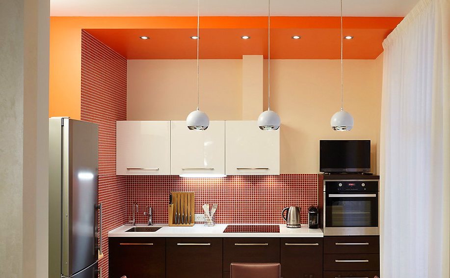
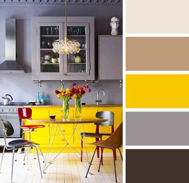
Very good the meaning of this law is shown in the photo below. Unfortunately, this is not the case, but the main thing here is to show you the rule with a live example:

As you can see, following this rule, we we get an interesting effect.
The room is essentially beige and brown, but we see it as yellow!
And, if you overload the accent, the look will look something like this:

Looking at this photo I remember: “Horses and people mixed together…” ©.
And for some reason we are sure that owner of the interior I wanted to emphasize the red color, but I just went too far.
But in the end, against the background of this bright red spot, neither the kitchen furniture, nor the stylish hood, nor the beautiful tiles on the apron are visible at all.
Of course, there will be designers who will immediately say: this is not bad taste, it’s just monochrome interior(that is, in which one color and all its shades are present).

But, you yourself understand that this is just a beautiful theory and words. But in reality, we just see a red spot that hurts our eyes.
So, you have to think carefully and decide what is really important to you.
And one more thing: the three-color rule does not mean that you need to choose only three colors.
It means that 3 colors are allowed.
That is, if you have a light beige wall as a background, then the floor can be made dark beige and the carpet almost white. But, all these shades need to be included in 60% of the original percentages.
The same goes for the second color and accent color. But, here too, without fanaticism. A spread of two or three tones will look organic, but a big contrast will look like two different color schemes.


Naturally, the room cannot do without a fourth or fifth color. There is no other way. But their share should be very small.
We identify the most important subject on which we would like to focus
So where do we start? Of course, by choosing a detail or object that you consider the most important and beautiful of the entire environment.
It could be:
- Wall decoration
- Finishing the work apron
- Kitchen furniture
- Stylish accessories
- Newest household appliances
No matter how much you would like it, but you need to choose one thing that you want to focus on. And it is this element that should include the main color that you focus on (in a ratio of 10% of the rest).
Let's say you have an incredibly beautiful work apron on the wall, red.

Then, you focus on it, and add a little more red in the form of splashes to the rest of the details: a small inclusion of red in the chandelier, paintings, decor.

Very small, please note! So that in total you get only 10% red.
But, let's look at each point in more detail.
We start from wall decoration
If you dream of an unusual and eye-catching wall decoration, then you will have to say goodbye to the thought of too bright furniture, flashy accessories and unusual floor coverings. Walls that are decorated pretentiously are very obliging.

And so that you can take a good look at them, you will have to give up other things and choose them as neutral in appearance and color as possible.
If you're willing to give it all up for colored walls, then go for it!
If you want to emphasize the deliberate asceticism of the walls(for example, just white, without decorations or other embellishments), then you need to select contrasting accessories, against which white wall It will look very appropriate and elegant.

This refers to paintings, chandeliers, shelves, etc.
White walls
The combination of white in the kitchen interior is possible with almost any color in the spectrum.

But, if white is taken as the background, then the most best second color – light color, natural wood. And already accented - whatever you like.
It’s simply impossible to come up with something better!

With this classic combination, almost any accent will be appropriate, except dark brown and black.
But if you make black the second color, and wood the accent, then you get a very elegant look!

In a word, the combination: white wall + unpainted wood is a classic that is good in any interpretation.
Colored walls (photo wallpapers, ornaments, etc.)
If you have flashy walls, then the furniture should be as simple and unobtrusive as possible. Otherwise, these walls will simply mix with the cabinets and there can be no talk of any elegance.
The combination of colors in this case should be something like this: a colored wall and plain furniture, moreover, in a contrasting color, and not in the same color scheme.
The best option for the second tone in this case:
- White
- Grey
- Brown
- Black
If you find it difficult to choose a good contrast for the second tone, then you can use the color selection spectrum.
Moreover, it is better to do this online, on a special service: https://colorscheme.ru
There you can choose both contrasts and color scheme mono colors.


If you figure out how to use this site, then you will never again be faced with the question of how to properly combine colors in your kitchen interior.
Stone walls
A stone wall is a very bright decorative element that doesn’t go well with anything other than white and light beige.

Any other color will simply “kill” the natural color of the stone, and it will not look expensive.
But if the stone itself is white, then it’s easier in terms of selecting a second color. But here you still need to take into account that not every furniture material or other decoration is compatible with stone.

There can no longer be any plastic, MDF, or metal here. Only natural materials and the most simple design.
Walls with stucco or plaster patterns
If there is modeling on the wall, then it is best for the main background to be white. The stucco design can be absolutely any and it is better if its color is an accent color, that is, it makes up only 10%, which we talked about above.
From a work apron
A bright work apron is such a detail on which a lot depends.

If you make colorful walls, then its beauty will fade. The same applies if the kitchen furniture is matched to the tone of the apron.
For example, now quite popular combinations are: a colored apron made of tempered glass and bright kitchen in tone
This is ugly, to put it mildly. And too intrusive. This is what it looks like:

If you have a colorful kitchen, then no colorful aprons! This is the law.
If the apron is colored, then no bright kitchens. This is important.
Here's what a colored apron looks like in combination with neutral furniture:

There is a difference, right?
Now, look at what the aprons look like in terms of color schemes. We have selected the most successful combinations and interiors with the right color.
Aprons in red tones
Red color does not tolerate the presence of many shades of its spectrum nearby. That is, pink, coral, burgundy, etc.

Only the right contrast or black, brown, gray and white A. The latter is a win-win choice.
Also, mirrors go wonderfully with a red glossy finish.

Aprons in blue and light blue tones
Blue really “loves” the white background color and natural, unpainted wood as an additional, second tone according to the three-color formula.

But blue, without any additives, is not the best option.
Blue is best used as a complementary color as it is too light for an accent color.
And so, it looks great paired with: light green, lilac, white and black.

Aprons in green tones
Green color goes well with yellow. If we are talking about shades of green, such as pistachio, olive and others, then yellow should be in their color scheme.

That is, sand and mustard would go well with olive, not pure yellow. Well, it also goes with white, just perfect.
Aprons in orange and yellow tones
Orange is “friends” with light green. Very good and fresh combination. It also goes well with orange. brown. You definitely shouldn’t combine orange with yellow, blue, violet, or lilac.

Aprons made from natural materials
Here we can say the same as about finishing the walls with stone. If you have a marble backsplash, then select furniture or flooring that matches the color of its veins.

If it is made of granite, then you can make the same window sills in color. In general, duplicate the material somewhere again, not exceeding 10%.
Aprons with ornaments
If you have an apron with some kind of pattern, for example, oriental, then it would be good to duplicate it either in curtains, or in tiles on the floor or in a chandelier. You shouldn’t “push” it everywhere, otherwise the result will be excessive diversity.

Furniture and walls should all be neutral colors and textures.
Based on the color of the tabletop
From the color of the kitchen furniture
The combination of colors in the kitchen interior most often depends on what kind of furniture you have.

Of course, if you are making a design from scratch and haven’t bought anything yet, then it’s easier for you.

But if there is already furniture, then you only need to “dance” from it and there are no other options, since it takes up large space and is the second, auxiliary color.
Unpainted wooden kitchen
The best background for such a kitchen is white walls.

And as accent colors - any colors except brown and dark orange. They will almost merge with natural wood.
Kitchen in white colors
White furniture looks great against contrasting colored walls. That is, if kitchen furniture is our 30%, then the background is 60%.

There is no point in listing what color white goes with, since it goes with absolutely any color!
Kitchen in red colors
Pairs very well with gray, stainless steel and mirror surface.
Also, it creates a good contrast with black, but it should be no more than 10%, otherwise it will be very dark and gloomy.

In addition, a red kitchen goes well with blue and white. This trio resembles sea colors and looks very fresh.

Here's a great option white and red kitchen. Here, although the percentage balance of colors is not maintained, it still looks pretty nice.

Kitchen in brown tones
Brown is a very capricious color and does not tolerate almost any neighbors except white and beige.
The remaining colors must be applied very carefully, otherwise, all the beauty brown kitchen will fade against a bright background.

Also, remember this: if you have brown furniture, then the floor must certainly be light. Otherwise, the room looks dark and sometimes even sloppy.
Kitchen in blue tones
A blue kitchen should not be combined with any colored walls. The maximum is a barely noticeable gray-blue tone of the wall. Or better yet, just white.


On other backgrounds, the blue simply doesn't look as bright as we'd like.
Kitchen in green tones
This is a very bright kitchen if the color is saturated. It is better, of course, to choose either olive or pistachio furniture colors.

But, if you already have a bright one, then the accent can be blue or lilac, and the background can be light yellow or white.
Kitchen in lilac tones
Lilac furniture goes well with light green, olive and khaki shades.


Also, lilac is combined with dark burgundy, white and black. Sometimes a pink accent looks good, but if there is an additional fourth color – black.
Kitchen in yellow tones
Sunny, goes well with a light green accent, lilac, and red. And as a background, white is ideal. However, he is always perfect.

We start from accessories and textiles
If your main goal is to emphasize the presence of beautiful things, then simply paint the walls white and lay a regular wooden floor on the floor.
No more additional decorations needed! Kitchen furniture in this case should also be as natural and discreet as possible: painted or unpainted wood, white plastic.

Not many styles are rich in accessories and textiles.
These are country and ethnic options. There is no point in listing them all; we will consider only a couple of the most popular areas.
Accessories in the Provence style
For accessories in the Provence style, colors painted in blue, blue and green wood and forged elements painted black.
There is nothing more to add, since the accessories and colors of the curtains are varied and here your task is simply to correctly combine them with each other.

Among them, there should also be something background: for example, textiles (curtains, a tablecloth interspersed with an accent), and other decorative items should contrast with them. There should be little emphasis.
Accessories in the Boho style

But here you can roam to the fullest! Boho is the style of Czech gypsies living in Bohemia.
Everything is appropriate here: walls painted in several colors, and at the same time a lot of incompatible accessories, different texture furniture and decoration.
In “Boho” it is impossible to overdo it, rather, on the contrary.
If you don't clutter the room enough, it won't look stylish, and the kitchen may just look tacky. But if there is a clear excess in everything, then the look turns out stylish, oddly enough.
In conclusion, I would like to say: combining colors in the kitchen interior is not as difficult as it seemed! We hope you found our selection useful.
- White- goes well with almost all colors. Best with blue, red and black; - Beige– goes with blue, brown, gray and white; - Grey – neutral color, which may be basic. Pairs well with beige/cream, pink, red, purple, brown, blue; - Pink– brown, white, olive, gray, turquoise are suitable for this color; - Red– ideally combined with yellow, white, green, blue and black, combination with gray is possible; - Brown– with bright blue, cream, pink, green, beige, light brown; - Orange- with blue, blue, lilac, violet, green; - Yellow– with blue, purple, light blue, gray, black, lilac; - Green– goes with golden brown, yellow, black, light beige; - Blue- to red, gray, orange, pink, white, yellow; - Blue– to purple, green, yellow, orange, red; - Lilac- to yellow, green, brown, beige; - Black- universal elegant color. Looks good with all colors. Pairs best with orange, pink, green, white, red, yellow.


Color plays huge role in a person’s life, it affects well-being, mood, performance, relationships. The kitchen is an important part of our home, we spend a lot of time there, so we should take seriously the choice of wall color for this room.
Basic rules for choosing wall colors for the kitchen:
- A large pattern visually reduces the size of the room.
- A small pattern, on the contrary, makes the room seem larger than it actually is.
- Geometric patterns on the kitchen walls in the form of intersecting stripes, like the patterns on Scottish kilts, create the illusion of continuous space.
- The vertical pattern “raises” the ceilings, visually “increasing” the height of the room.
- The horizontal pattern and horizontal stripes on the walls “expand” the kitchen while simultaneously reducing its height.
- Diagonal lines on the walls add dynamics to the kitchen interior, creating the illusion of movement.
- Textured wallpaper looks very extraordinary. By endowing the surface of the walls with new qualities, they are able to create an additional dimension in the room. Thanks to the play of shadows and penumbra, curious color nuances and unexpected alternations of textures can produce a lot of interesting effects.
- By When choosing the color of your kitchen, do not forget about your own tastes and preferences.
- Undoubtedly kitchen set must harmonize in color with others design solutions rooms: ceiling, walls, floor. However, first of all, its color should evoke only positive emotions in you.Psychologists never tire of repeating that the color of the things around us directly affects our character, mood, well-being and even performance.
Planning to renovate your kitchen or planning to buy a new one kitchen furniture, everyone is faced with the problem of decorating the kitchen interior and choosing colors for such important room our home.
1. All dark colors are able to hide and reduce space, while light colors expand it. Therefore, for a small kitchen it is advisable to use pastel colors in combination with bright accents. An overly spacious kitchen can be made more comfortable if you combine bright shades and discreet dark colors in its interior, and make the kitchen set two-tone.
2. The kitchen interior can be made multi-colored or single-colored. In a multi-colored kitchen, one color should be dominant.
Monochrome (monochrome kitchen)
If you are going to decorate your kitchen set in a single color, you need to not just choose one color for the set itself, but use its shades in the interior design.


The basis of high-quality kitchen design lies in maximum harmony of furniture and decor with the decoration of walls, floors and ceilings. It is very important that the components of the interior match each other both in stylistic direction and in color scheme.
Every person associates the kitchen in their home with comfort and warmth. hearth and home. This effect can only be achieved with the right combination of colors in the kitchen interior.


Design tips for choosing color palette and its intensity:
* The kitchen area can be decorated in several colors. However, you should not use more than three shades, as in this case the main idea of the room design will be lost.
* If the color of the walls and the color of the kitchen set are the same, then the shade of the furniture should be darker, at least one or two positions.
* Table top and apron ( wall panel) it is advisable to decorate it in colors opposite to the kitchen set and other furniture. The game of contrasts helps to place the right accents.
* If the furniture in the kitchen is of light, unsaturated colors, then the walls, curtains, upholstery for chairs or sofas, and tablecloths must take the lead in using brighter and more catchy colors. Otherwise, the kitchen will be boring and uninteresting.
* If the walls are painted in bright, attractive colors, then the kitchen set should be made in calm colors that do not attract the eye. And vice versa. The provocative color of the kitchen set does not allow for walls that are active in color.


Color combination rules:
White - goes with everything, best with blue, red and black
Beige - goes with blue, brown and white
Gray is a boring color that is nonetheless basic. Pairs well with dark pink, red, purple, bright blue
Pink - brown, white, olive, gray, turquoise are suitable for this color
Red - goes perfectly with yellow, white, green, blue, gray and black
Brown - with bright blue, cream, pink, green, beige
Orange - with blue, blue, lilac, violet
Yellow - with blue, lilac, light blue, gray, black
Green - goes with golden brown, yellow, black, light beige
Blue - to red, gray, orange, pink, white, yellow
Blue - to purple, green, yellow, orange, red
Black is a universal, elegant color. Looks good with all colors. Pairs best with orange, pink, green, white, red and yellow.
At first glance, choosing the perfect color scheme for your kitchen seems like a difficult and impossible task. Indeed, you need to spend a lot of time to achieve the desired result. However, if you apply the above rules in practice, you will see that the game was worth the candle.


A popular kitchen color option is a combination of the base color and its shades with white.


* Large drawings on the walls visually reduce the size of the room. * A small pattern, on the contrary, makes the room seem more spacious than it actually is. * Geometric patterns on the kitchen walls in the form of intersecting stripes, like the patterns on Scottish kilts, create the illusion of continuous space. * The vertical pattern “raises” the ceilings, visually “increasing” the height of the room. * Horizontal patterns and horizontal stripes on the walls “expand” the kitchen, while simultaneously reducing its height. * Diagonal lines on the wallpaper bring dynamics to the kitchen interior, creating the illusion of movement. 
Today designers are actively using interesting option- use silver instead of white. If white color in a monochromatic interior can be called a traditional choice, then the use of silver color meets the latter fashion trends interior design. Designers love metallic for its neutrality and the ability to combine this color with many others. Gray Perfect for the kitchen due to its practicality and non-staining nature.


To prevent a monochromatic kitchen from turning out boring, designers recommend sticking to certain rules:
* choose at least three additional shades in the interior, one of which should be dominant.
* use different shades of the base color to divide the kitchen into functional areas. This technique, among other things, allows you to correct planning deficiencies.
* use different textures of materials - one color looks different on materials of different textures.


Contrasting accents. Even one item that contrasts with the main color of the kitchen will make a monochromatic interior more “alive.” The already mentioned black color and any bright shades are suitable for this. The main thing is not to oversaturate the kitchen interior with individual bright details.


Another option for using flowers- two basic colors and complementary shades of transition from one color to another.


Contrasting color combinations in the kitchen interior
When using contrasting color combinations in the kitchen interior, you need to be extremely careful. Because in this case, you risk making the kitchen overly aggressive or tastelessly decorated.
A combination of colors opposite in spectrum, where only one of the selected colors is the main one, looks advantageous in the interior.
A contrasting kitchen looks stylish and fashionable.


Upon registration contrasting interior the starting point should be the furniture.
Furniture should be darker than the walls and lighter than the floor.
Most popular combinations colors for the interior of a kitchen decorated in a contrasting way: * orange and blue * orange and black, gray * yellow and purple * peach and blue* white and black * red and black * red and gray * red and white * beige and dark brown * green and black * lilac and warm green In addition, a combination of any bright color with white or black is considered contrasting.


 Conclusion Whatever design option you choose, whatever combination of colors in the kitchen interior you decide on, stick to basic rules:
*White or black can be combined with almost any other color without risk.
* In a multi-colored kitchen interior, use no more than five shades and no more than two colors for the kitchen set.
* The main (dominant) color in any combination should be only one color.
* Glossy surfaces enhance the depth and saturation of color, matte ones mute.
* All decorative elements kitchens act as color accents, so they should be the brightest.
Conclusion Whatever design option you choose, whatever combination of colors in the kitchen interior you decide on, stick to basic rules:
*White or black can be combined with almost any other color without risk.
* In a multi-colored kitchen interior, use no more than five shades and no more than two colors for the kitchen set.
* The main (dominant) color in any combination should be only one color.
* Glossy surfaces enhance the depth and saturation of color, matte ones mute.
* All decorative elements kitchens act as color accents, so they should be the brightest.
Design wisdom says that there are no incompatible colors. The combination of colors in the kitchen interior depends, first of all, on your taste preferences.


The kitchen is a room where it should be comfortable, practical and pleasant at any time of the day. In the morning we need to cheer up with a cup of coffee, in the afternoon we need to have lunch in a cozy atmosphere, and in the evening we need to have dinner with our family and relax. Do you agree that these effects can be achieved using colors and shades? In Russian apartments, kitchens in the colors of cinnamon, burnt acorn, chestnut, and roasted coffee have taken root: it’s easy to match brown with other tones, be it walls, furniture, or textiles. But this does not mean that the color combination in the kitchen interior is stuck on chocolate, beige, and coffee. We invite you to familiarize yourself with the classic and original color palette used in modern kitchen space.


How to use color combinations in the kitchen interior?
The color of the kitchen depends on personal preferences, its size, the character of the owners and the expected effect. If you want to approach it in terms of its purpose in the apartment, then you should use a selection of “edible” colors:
- crimson

- pistachio

- lime

- orange

- eggplant

- caramel

They help increase appetite and delight the eye with natural colors. Bright colors create a cheerful and optimistic atmosphere, but can also confuse those who do not quite understand how to choose a kitchen color. For example, a rich red color, which undoubtedly attracts attention and awakens the appetite, should not be used in the kitchen by people prone to melancholy who prefer moderation in food.

Calm colors, although they suppress the desire to have another snack, but promote relaxation and rest.

Muted or bright colors in the interior can change the space. If the kitchen is small, then using dark shades will reduce it even more, but light colors will enlarge it and make it more spacious. And in a large room, dark colors are just appropriate: comfort and a homely atmosphere are guaranteed. Designers advise using 2-5 shades (but no more) in the kitchen, among which one should be dominant, that is, make up 60% of the total palette.

This is necessary in order to “mute” or “strengthen” its effect. When there is too much of one color, the effect of its “pressure” on the human psyche can occur.

The color accent in the room is primarily the furniture. The texture should not contain more than 2 colors that are compatible with each other. One of them is dominant. In some headsets, the “bottom” is darker than the “top” - and this is the correct design.

If the furniture is bright, then the walls are kept in neutral colors, and for a monochromatic set contrasting tones surrounding decor.


If you are puzzled by the question “What color to choose for the kitchen?”, you should not rely only on the advice of other people, but on your own feelings of a particular shade. To make a quicker and smarter decision, we recommend taking a “walk” through the main colors of the kitchen interior.
White color in the kitchen interior
The white color in the room will absolutely affect its size, visually expanding the space. But as practice shows, it is not practical in the kitchen, although it looks very advantageous, formal and stylish. A designer selection of several shades will help avoid an abundance of white.

What colors are ideal for him? Red, black and blue. But together with bright yellow, gray, light and dark beige, white will add lightness, spaciousness, a feeling of summer and freshness to the interior.

In a white kitchen with properly selected furniture and appliances, there is never enough space. The color will fit perfectly into the Scandinavian interior style, minimalism, hi-tech with its chrome parts. Let's also not forget about retro styles, such as art deco, the Victorian era, the design of the early and mid-20th centuries interspersed with bright colors in the interior. White is a good color, but “insidious”! An excess of white will lead to headaches; if it is in acceptable quantities, then there will be peace and tranquility in the soul.
Green in the kitchen space

All shades of green are suitable for the kitchen space, with the exception of olive. Some of them are classified as “edible”: pistachio, light green, lime. And then, green is the color of forests and grass, so it gives a feeling of comfort and protects against stress and depression.

When choosing what color the kitchen should be, people working in stressful jobs should choose green shades. Then they will quickly return to normal after a psychologically and physically difficult day of work. You should also take into account the cardinal directions where you are “looking” kitchen windows.

For a kitchen, the color combination of green, blue and ocher is ideal if the constructivist style is chosen for it. Everything is concise and functional! Thanks to the green “freshness”, where Provence or country style reigns, harmony will be felt and spring mood. “Classic” suits green - here’s another design for you.

Blue shades for kitchen design
Many people are accustomed to the fact that blue color is appropriate in the bedroom and bathroom. However, its relative “coldness” is attractive to designers: it visually expands the space and also “suppresses” appetite. If you are unsuccessfully struggling with the constant desire to snack, blue cuisine is your “helper” and “savior” from excessive food intake.

Blue as a symbol of the sky and expanses of water, is associated with relaxation. That is why in the conditions of “cool” Russia it is more than appropriate. The blue kitchen creates an atmosphere of relaxation and calm. It will not be hot for those whose kitchen windows face south.
Blue harmonizes with the colors of the rainbow and “loves” contrast. Having done bright accent on details or textiles, you will achieve a “delicious” effect. For example, for azure and gray-azure, a crimson, muted pink shade is successful.

Canary yellow, soft blue and beige shades will harmonize with bright azure.
Possible styles:
- classic,
- country,
- shabby chic,
- Scandinavian style.
"Brown style"
Perhaps no other combination of colors in the kitchen interior gives such a lasting feeling of stability, positivity and comfort as brown and its “relatives”. Brown was popular many years ago and is still relevant today. It exudes nobility, and light tones are more versatile than dark ones and can be combined with many shades and textures.

Brown is used in loft, classic, country styles, and is required in English. “He” especially stands out against the background of beige, cream, green and blue, as the photograph demonstrates.

The designers proposed a version of a modern kitchen where steel and “wet stone” colors dominate, and selected yellow, cream and chocolate act as additional accents.

In the modern furniture and finishing industry, brown wenge is increasingly used. It is distinguished by its “goldenness”, dark veins and abundance of shades.

Orange color to increase appetite
The color of a ripe orange is “delicious”, “edible”, that is, it increases appetite and mood. Due to the brightness of the colors, it is often used in the interiors of cafes and restaurants. Designers recommend using at least a little orange in the kitchen and dining room to... whet your appetite.

It harmonizes perfectly with purple, green and blue. But often it is “interspersed” like a “bright spot” in black and white design, with shades of gray and blue. Styles for orange interior- minimalism, ethnicity, classic, modern.

Gray for high-tech style
Do you find gray boring? In vain - not only are there beautiful tones and half-tones of gray, it can also be effectively combined with other shades. And in the kitchen it is ideal because it is practical.

Modern designers also recommend using uncharacteristic colors for the kitchen - the photo shows silver furniture and metal parts. The combination of “silver” with bright orange and cream gives a unique effect, best for high-tech style.

Black - elegant design
Brave and creative people can afford black cuisine, although it is not necessarily mournful, gloomy and mystical. Skillfully combining it with other shades allows you to create unique design, and the room will turn from unsightly into presentable and stylish.

Black is the color of elegance, luxury and respectability. It is used in luxury hotels. In the kitchen space, the choice of colors “black ebonite”, “charcoal”, “prune” is relevant for the style of minimalism, retro and hi-tech.


Now you have an idea of how to choose a color and that choosing different color combinations in the interior is not an easy task, but a real one. Its “solution” will take time and require effort. But when you are satisfied with the chosen option, you will understand that the costs were worth it!