How to make emerald color from gouache. Mixing colors.
How to get new colors by mixing paints.
In painting, the desired color can be obtained in different ways. For example, putting paint in pure form without mixing with others or obtain the desired color by mixing two or more paints.
Some paints may interact undesirably when mixed. As a result, cracking of the colorful painting layer may occur. The color obtained from mixing may change - gray, darken. For example, a mixture of red cinnabar and white lead produces a beautiful pink paint. However, as a result of chemical interaction, the resulting color darkens after some time.
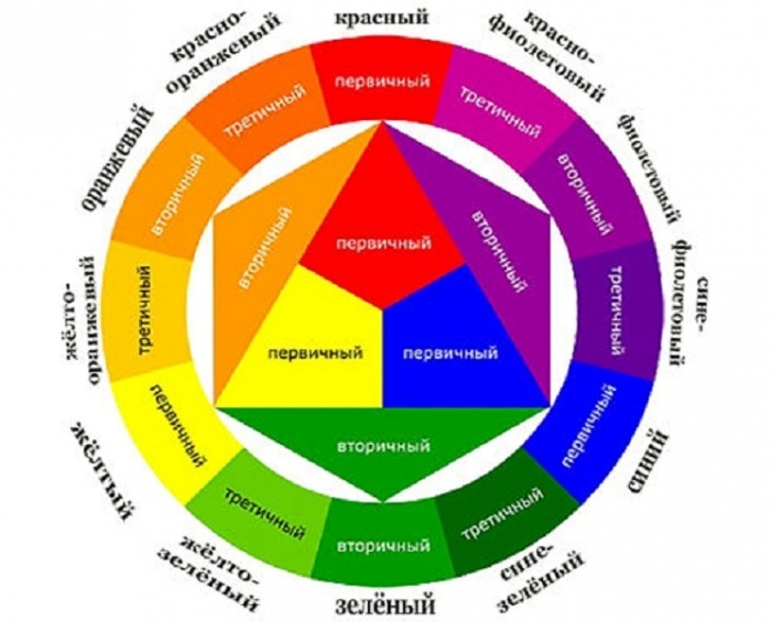
Yellow, red and blue colors cannot be obtained by mixing any paints. At the same time, when mixed with each other or mixed with other paints, they give an extremely wide variety of color combinations.
An endless variety of shades can be obtained by mixing any two colors. Depending on the amount of one color mixed with another, the resulting color will be closer to either one or the other color being mixed. For example, mixing yellow and blue paints in equal quantities, we get green.
By mixing a certain amount of yellow paint each time to the resulting green color, you will be able to observe how more and more green tones gradually turn into yellow. Receive blue It is possible if you gradually add blue paint in certain quantities to the green color obtained from mixing yellow and blue paints.
Mixing a chromatic color with another chromatic color that is close to the complementary color on the color wheel does not produce a pure color tone, although the resulting color will have a clearly defined chromatic hue. So, if you mix green with purple or with orange, which has a reddish tint, then the resulting color will approach achromatic.
Thus, the further the colors are removed from each other on the color wheel, the closer they are to complementary ones, the less saturated the color is obtained as a result of their mixing, i.e. they acquire a gray color. Conversely, the closer the colors are located to each other on the color wheel, the closer they are color tones, the cleaner and richer their mixtures look.
Gray color is obtained by mixing white and black paints in certain proportions. In watercolor gray made by diluting black paint with water and using white tone paper. Gray color can take on a relatively cold or warm shade. In the first case, to gray in not large quantities you can mix blue or green paints; in the second - light ocher, natural sienna or umber.
The painter should strive to use the minimum amount of paint to create the impression of multicolor. At the same time, he must know which paints are permissible to mix with each other and which are not, in order to exclude low-resistant paints from the set - those that turn black, fade, etc. To acquire practical skills in obtaining durable paint mixtures and avoiding unwanted mixtures, we recommend that students carefully study the table unwanted mixtures of artistic oil paints and try them out in practice. As you gain experience in painting, this knowledge and skills will constantly improve.
|
Apricot |
Red + Ocher + White (Red + Yellow + Brown + White) |
|
|
White + Brown + Yellow |
||
|
Turquoise |
Blue + Green |
|
|
Mustard |
Yellow + Red + Black + Green |
|
|
Yellow + Cyan or Blue |
||
|
Green Olive |
Green + Yellow |
|
|
Green Coniferous |
Green + Yellow + Black |
|
|
Yellow + Red or Brown |
||
|
Brown |
Red + Green (Red + Yellow + Blue) |
|
|
Red-brown |
Red + Brown |
|
|
Lemon Yellow |
Yellow + White + Green |
|
|
Orange |
Red + Yellow |
|
|
Yellow + Brown |
||
|
Purple |
Red + Blue + Yellow |
|
|
White + Black |
||
|
Gray warm |
Gray + Ocher or Umber |
|
|
Gray cold |
Gray + Blue or Green |
|
|
Tobacco |
Yellow + Green + White + Red |
|
|
Terracotta |
Orange + Brown (Red + Yellow + Brown) |
|
|
Violet |
Red + Blue |
|
|
Brown + Green |
||
|
Red + Blue + Green |
Learning to draw: mixing acrylic, oil, watercolor paints. All kinds of shades from three primary colors.
Without creativity human life empty and uninteresting. Painting, like music, is learned not only in order to be realized in life, but also in order to find an outlet in life, a hobby that will bring joy and peace to life. And where there is drawing, so is mixing colors. This is exactly what this article is dedicated to. In it we will tell you how to mix and obtain new colors and shades of the most common paints in painting.
How to properly mix acrylic, oil and watercolor paints to obtain the desired color: table, proportions
Mixing acrylic paints
We suggest you familiarize yourself with the lesson of the famous artist and called teacher, author of the book “Acrylic Painting with Lee Hammond”. Lee Hammond warns that although we supposedly know from childhood that mixing red and blue will get purple, acrylic paints have a different pigmentation and most likely you will find brown on the palette.
Important: read the pigments on the packages. Have you seen on store shelves there are up to 15 types of the same shade? Do you think this is to fill a display case? No, it is the same color with different pigments. Therefore, we write down or photograph on a smartphone the color - the necessary pigment - and with this we go to the store to replenish the paints.
Also note that the pigments are transparent, translucent and dense in consistency. Therefore, you can buy completely different structures from the same paint manufacturer. This is not a defect, but the properties of the pigment.
So, in order to get an almost full range of colors, only 7 colors are enough. For beginners, it is recommended to purchase exactly these colors, and in the future, at your own discretion, purchase additional shades.
Please note that we do not specifically translate the names of the primary colors so that you can name them in the store and purchase the necessary pigments:
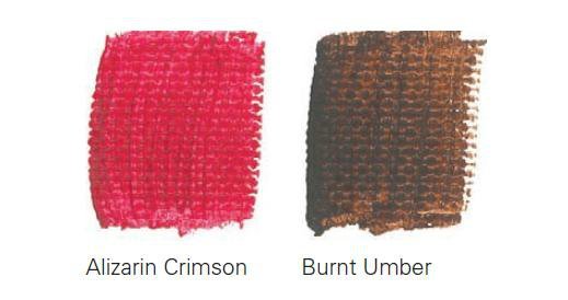
- Base: Cadmium Yellow Medium
- Base: Cadmium Red Medium
- Main: Prussian Blue
- Additional: Alizarin Crimson
- Additional: Burnt Umber
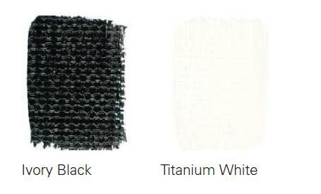
- Neutral: Ivory Black
- Neutral: Titanium White
We bought, prepared the canvas for the experiment and move on to the magic.
Experiment one - mix each color with white and get new, amazing pastel and delicate shades. We provide a table of strokes with a caption of what we mixed.
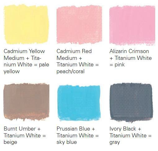
Well, now, from left to right, from first to bottom, let’s look at the shades that we managed to get: fawn; peach or as it is also called coral; soft pink; beige; sky blue; gray or light asphalt.
Now we try to mix all the colors with black, the result is in the table below.
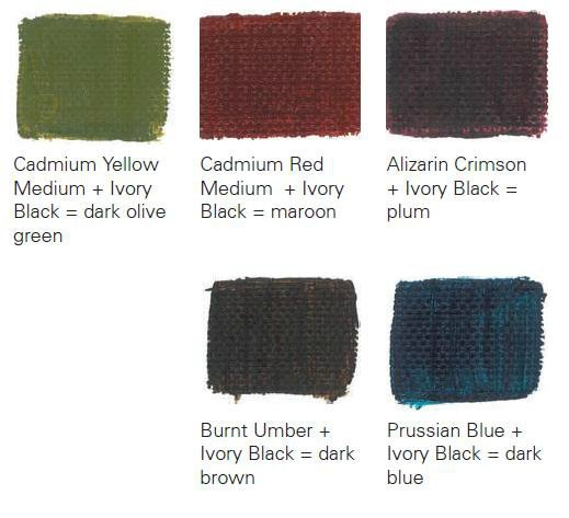
And we got these colors: khaki or dark green; chestnut; plum; deep brown; dark blue.
But this is all simple, now let's move on to a more complex mixing option acrylic paints, but interesting! Mix and get all shades of green.
As we already did, we mix the two colors that are under the stroke and get exactly this shade.

Additionally we received: olive green color; a gray-green tint reminiscent of asphalt after rain reflecting the green crowns of trees; bottle green; mint.
The next step is purple and purple tones and halftones. In order to obtain such shades, you will need to have Prussian blue or alizarin pink or cadmium red in the work kit. Two examples for mixing: Prussian Blue + Cadmium red medium or Prussian Blue + Alizarin Crimson.
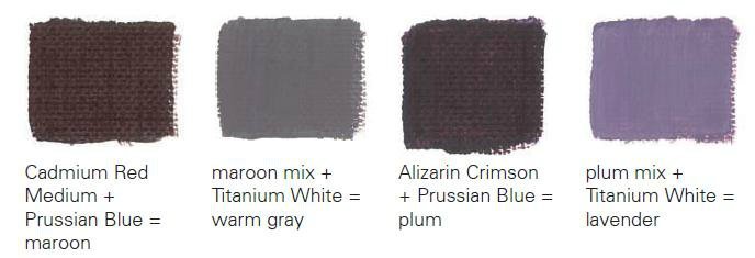
The colors we got were chestnut, rich warm grey, plum and a hint of lavender.
Now add white pigment and stir, add another drop to each option. Notice the riot of color in your hands!
Sunny shades. This is what artists like to call shades of orange; these are wonderful uplifting tones. They are made by mixing red with complementary colors.

On this table we got: orange as it is, peach, brick, coral.
Earthy tones can be achieved by adding burnt umber (international meaning Burnt Umber). If there is a need to get pastel shades of these tones, then just add a drop of white pigment.
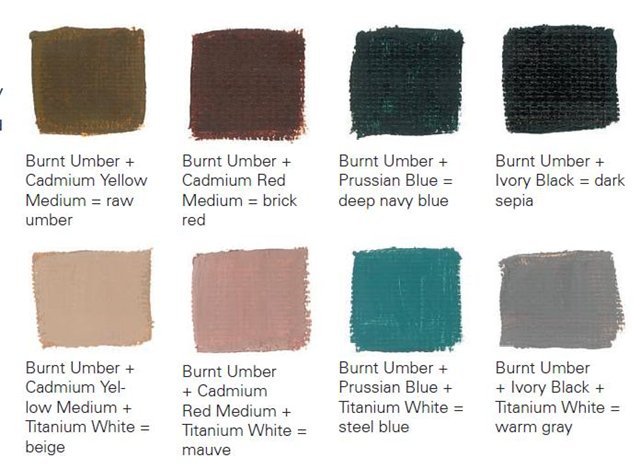
In this case, we got earthy shades: umber; brick; dark turquoise; dark sepia; dirty beige; pastel lilac; steel blue; Warm gray.
Mixing oil paints
IN oil paints The situation with the palette is a little simpler and one pigment is used in one color, so we will not give the main colors, but will leave only the name of the color. The rules that we remember from childhood are precisely the rules of oil paints.
| What color should you get? | What colors need to be mixed |
| Pink | Add red paints drop by drop to white paints until the desired shade is obtained. |
| Chestnut | Add red to brown and, if necessary, darken - a drop of black, lighten - white. |
| Purple red | Add blue drop by drop to red |
| Shades of red | Red with white to highlight, red with black to darken, red with yellow for purples and oranges. |
| Orange | Add red to yellow, drop by drop. |
| Gold | Add a drop of brown and red to the yellow until the required shade is obtained. |
| Shades of yellow and orange | Yellow with white, yellow with black, yellow with red and brown. |
| Pastel green | Yellow with a drop of blue, yellow with a drop of blue and black. |
| Grass color | Yellow with a drop of blue and green. |
| Olive | Add yellow to dark green, drop by drop. |
| Light green | Add white drop by drop to green, and a drop of yellow for depth of color. |
| Turquoise green | Green with a drop of blue. |
| Bottle green | Mix blue with yellow. |
| Green needles | Add yellow and black drop by drop to green. |
| Light turquoise | Add green and white to blue drop by drop to lighten it. |
| Pastel blue | Gradually add white to blue. |
| Wedgwood blue | Add 5 drops of white and 1 drop of black to blue until the desired shade is obtained. |
| Royal blue | Add black and a drop of green to blue. |
| Dark blue | Add black to blue and a drop of green at the end. |
| Grey | We dilute the white with black, adding green to get an asphalt tint. |
| Pearl gray | Add white to black and a drop of blue. |
| Brown | Mix yellow, red and blue in equal proportions, diluting if necessary with white, black or green for the desired shade. |
| Brick | Red with yellow and a drop of blue, if necessary with white. |
| Brown-gold | Red with yellow, blue and a little white. Yellow is used most for expressiveness. |
| Mustard | In yellow, a drop of red and black, for a piquant color, a drop of green. |
| Beige | In brown, add a drop of white; if you need bright beige, add a drop of yellow. |
| Off white | In white there is a drop of brown and black. |
| Pinkish gray | In white, a drop of red and black. |
| Gray-blue | Add gray and blue to white. |
| Greenish gray | Add green to gray and, if necessary, white. |
| Light charcoal | Drops of white into black. |
| Citric | In white there is a drop of yellow and green, more yellow. |
| Pastel brown | Add a drop of green to yellow and mix it with brown and white. |
| Fern | Green with white and a drop of black. |
| Coniferous | Mix green with black. |
| Emerald | Add yellow and a drop of white to green. |
| Bright light green | Add yellow and white to green. |
| Bright turquoise | Add green to white and a drop of black for depth of color. |
| Avocado shade | Add yellow to brown and a drop of black. |
| Royal purple | Add red and yellow to blue. |
| Dark purple | Add blue to red and a drop of black. |
| Tomato color | Dilute red with yellow and add brown. |
| Tangerine | A drop of red and brown into yellow |
| Chestnut with reddish | Dilute red with brown and a drop of black for shading. |
| Bright orange | Dilute white with orange and brown in equal proportions. |
| Marsala | Red with brown and a drop of yellow and black. |
| Crimson | Add white to blue, a little brown and red. |
| Plum | We mix blue with red and white, darken it with black. |
| Light chestnut | Red with yellow and diluted with black and white. |
| Honey | We dilute brown with white and yellow. |
| Dark brown | Red with yellow and black. |
| Gray gray | Gradually add red and white to black. |
| Color eggshells | Yellow with white and a drop of brown. |
Mixing watercolor paints
Watercolor paints are mixed according to the same principle as oil paints, except that watercolors are translucent and the shades are more muted. We recommend working through the table above first, and only then moving on to drawing on canvas.
Basic colors for mixing paints
There are only three primary colors in paint mixing. These are red, blue and yellow. White and black are considered additional. Thanks to these colors you can get absolutely all shades of the rainbow.
This article does not give ready-made solutions, because it is impossible to squeeze out paint or smear a certain amount of milligrams, this article gives the direction in which you can go to work and develop. Try, experiment and you will definitely end up with a delicious creation. And painting works much better than any psychologist, relieves stress, distracts from problems and helps you see the beauty in the ordinary!
Video: How to get brown, purple, blue, red, beige, orange, pink, gray, lilac, black, turquoise, mint, green, olive, blue, lilac, pistachio, khaki, yellow, fuchsia, cherry, marsala, white when mixing paints?
Knowledge of color mixing options can be useful not only in professional activity artists. Custom design living space often poses the question to the designer of how to achieve this or that interesting halftone. The proposed combination options and color mixing table will help you achieve the desired effect.
Everyday life is filled with a wide range of different colors. To get the right one, you need to know the intricacies of combination.
Blue, red and yellow paint are the three pillars on which a wide palette of halftones rests. It is impossible to form these colors by mixing other colors. At the same time, combining them with each other gives an unusually large number of combinations.
Important! You can create a variety of shades by mixing only two colors by changing their proportions.
Depending on the volume of one part of paint added to another, the resulting result approaches one or another original color. One of the most famous examples is mixing blue and yellow to create green. The resulting result, when adding new portions of yellow paint, will gradually change, getting as close as possible from green to yellow. You can return to blue by adding more of the original element to the green mixture.
Mixing chromatic colors that are located close to each other on the color wheel produces a paint that does not have a pure tone, but has an expressive chromatic hue. Combining colors that are in opposite sides chromatic circle will result in an achromatic tone. An example is combining orange or purple with green. That is, a mixture of colors located closely in the color wheel gives a rich chromatic shade; the maximum distance of colors from each other when mixed leads to a grayish tone.
Individual paints, when interacting, produce undesirable chemical reaction, which may result in cracking of the decorative layer. In some cases, the resulting background may darken or turn gray. A clear example A mixture of white lead and red cinnabar is used. Attractive pink It gets darker over time.
It is optimal when the impression of multicolor is achieved by mixing a minimum number of colors. At the same time, it is important to consider which paints, when mixed with each other, give a lasting result, and which ones are unacceptable to combine. The knowledge gained allows us to eliminate paints that fade or darken in the future from work.
The table of unwanted mixtures below will help reduce the risk of erroneous combinations:
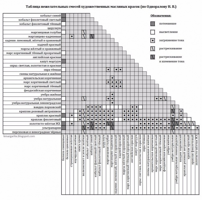
Having tried the examples given in practice, future painters and designers will gain valuable professional experience.
Methods for obtaining red and its shades
Red is one of the three primary colors and is necessarily present even in minimal sets. But for mass printing, magenta tone is used. The answer to the question of how to get red is quite simple: mix the proposed magenta with yellow in a 1:1 ratio. There are other options for getting red when mixing paints:
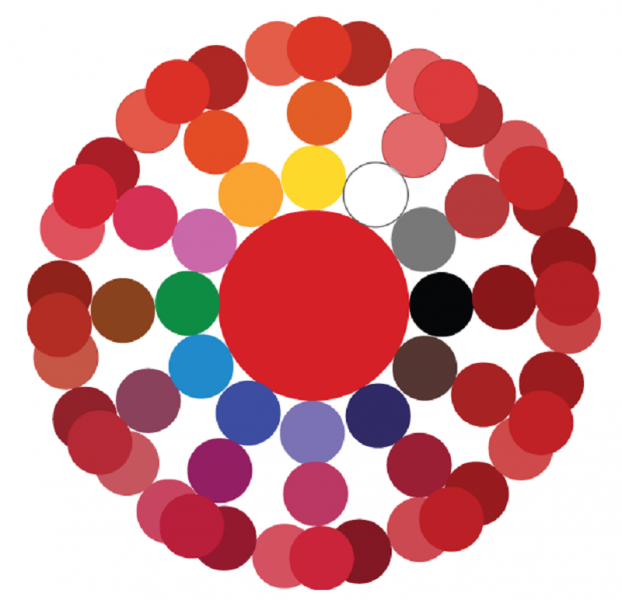
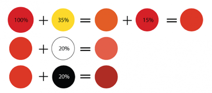
The main red is located in the center. Next are the options for mixing. The next circle is the result of combining the first two colors. Finally, color options are presented when adding red, black or white paint to the final result.
Blue and its shades
Blue is considered a primary color, so to form all its shades you will need blue paint.
Attention! No combination of other colors produces a shade of blue, so the presence of this paint in the kit is mandatory.
Even with a set of 12 colors available, the question periodically arises of how to get blue. The classic tone is called “royal”, and in a set of acrylic paints the main color is often ultramarine, which has a bright dark shade with a purple undertone. A lighter effect can be achieved by mixing blue and white in a 3:1 ratio. Increasing the white leads to a lighter tone, up to a sky blue. If you want to achieve a moderately rich result, dark blue paint is mixed with turquoise.
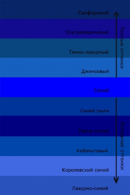
Let's look at what colors need to be mixed to get shades of blue:
- The effect of a dark blue-green tone is achieved by mixing blue and yellow paint in equal proportions. Adding white paint will result in a lighter shade while reducing the brightness due to the combination of the 3 elements.
- The creation of “Prussian blue” is carried out by mixing 1 part of the main blue and adding 1 part of a composition of bright green and light green. A rich and deep shade can be diluted with white, and its purity will not change.
- Combining blue and red in a 2:1 ratio produces blue with a hint of purple. Adding white allows you to lighten a dark and rich tone.
- Royal blue is distinguished by its brightness; a similar effect is achieved by mixing the main blue with mangento pink in equal parts. An admixture of white traditionally brightens the result.
- Combination with orange gives a gray mass. Replacing orange with brown in a 1:2 ratio to the base creates dark color with a complex gray-blue tint.
- The formation of dark blue occurs with the help of an admixture of black in a ratio of 3:1.
- You can create a blue tone yourself by mixing the main color with white.
A small table of combination options is presented below:

Green color palette
Solving the problem of how to get green if it is not in the set is quite simple: combine yellow and blue. A rich palette of green halftones is created by changing the proportions of the original components and adding additional elements, performing the function of darkening or lightening. Black and white paint plays this role. The olive and khaki effect is achieved by mixing two main elements (yellow and blue) and a slight admixture of brown.
Comment! The saturation of green depends entirely on the quality of the constituent elements: intense tones of the source materials guarantee a bright result.
If green is obtained by mixing, then all subsequent undertones will be duller. Therefore, it is better to experiment with the range of green if you initially have a ready-made primary color. There are many combination options:
- A combination of blue and yellow in equal proportions produces a grassy green.
- Increasing yellow to 2 parts and adding 1 part blue results in a yellow-green effect.
- An experiment on the contrary in the form of a blue-yellow proportion of 2:1 will allow you to obtain a blue-green tone.
- If you add ½ part of black to the previous composition, you will achieve a dark green effect.
- Light green warm tone formed from yellow, blue and white paint in a ratio of 1:1:2.
- For a similar light green shade, but a cool tone, you need to take yellow, blue and white base in a ratio of 1:2:2.
- Dark olive color is formed by mixing equal parts of yellow, blue and brown paint.
- The gray-brown tone is obtained from similar elements in a ratio of 1:2:0.5.
The expressiveness of the green color is directly dependent on the original elements; accordingly, the brightness of the halftones is based on the saturation of the green. The graphic palette gives a clear idea of the mixing options:
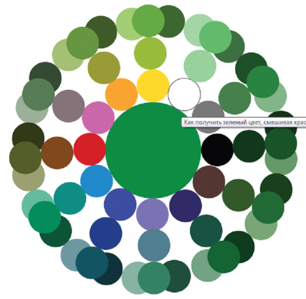
As in the case of the red circle, the main paint is located in the center, followed by mixing options, then the result of the experiments. The final circle is the shades of the previous level when adding base, white or black paint.

Other combination options
There are many other techniques to create the desired effect by adding some kind of dye to the base color. The answer to the question of how to get ivory color is multifaceted and depends on the surface where you plan to apply the paint. The simplest option is to mix snow-white basic basis with yellowish. For example, yellowish ocher or a minimal amount of strontium is added to white. To tint paper, a small amount of potassium permanganate is diluted in water. A light pink tint indicates a correctly diluted solution. A cotton swab, brush or sponge is moistened with the resulting composition, after which the surface of the paper is treated.
Advice! For double-sided tinting, the sheet can be dipped in a container with a solution of potassium permanganate for a couple of minutes. After drying, it will acquire the desired ivory effect.
There are also several ways to get black:
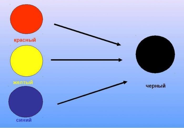
- by mixing three basic colors red, blue and yellow;
- when combining cyan, magenta and yellow;
- a combination of green and red, but the result will not be 100% clear, but only close to the desired effect.
We will try to answer the most popular questions about mixing options:
- How to get crimson color: the base is blue with the addition of red, white and brown tones.
- You can get turquoise color, whose second name is aquamarine, by mixing blue and green. Depending on the proportions, the tones of the new shade range from soft pastels to intense and bright ones.
- How to get yellow? It is a basic color and cannot be obtained by combining other colors. Something similar to yellow can be created with watercolors by combining green and orange or red. But it is impossible to achieve purity of tone in this way.
- How to get a brown tint? To do this you will need basic paints: red, yellow and blue. First, a small amount of yellow is added to the red (in an approximate ratio of 10:1), then the volume is gradually increased until an orange tone is obtained. After which they proceed to the introduction of the blue element, 5-10% of the total volume will be enough. Minor adjustments to proportions will produce a wide variety of brown effects.
- Combining black and white elements in different proportions gives a diverse range of gray tones.
As you can see, there are options to achieve desired effect There are countless numbers in the creative design process. The information presented will be supplemented by a table with options for mixing colors and video:

Two color mixing tables
The color mixing table allows you to learn how to get the right one when mixing two or more colors and shades.
This table is used in various fields art - fine art, modeling, and others. Can also be used in construction when mixing paints and plasters.
Color Mixing Chart 1
| Required Color | Base Color + Mixing Instructions |
| Pink | White + add a little red |
| Chestnut | Red + add black or brown |
| Royal red | Red + add blue |
| Red | Red + White to brighten, yellow to get orange-red |
| Orange | Yellow + add red |
| Gold | Yellow + a drop of red or brown |
| Yellow | Yellow + white for lightening, red or brown for a dark shade |
| Pale green | Yellow + add blue/black for depth |
| Grass green | Yellow + add blue and green |
| Olive | Green + add yellow |
| Light green | Green + add white/yellow |
| Turquoise green | Green + add blue |
| Bottle green | Yellow + add blue |
| Coniferous | Green + add yellow and black |
| Turquoise blue | Blue + add a little green |
| White-blue | White + add blue |
| Wedgwood blue | White + add blue and a drop of black |
| Royal blue | |
| Dark blue | Blue + add black and a drop of green |
| Grey | White + Add a little black |
| Pearl gray | White + Add black, a little blue |
| Medium brown | Yellow + Add red and blue, white for lightening, black for dark. |
| Red-brown | Red & yellow + Add blue and white to brighten |
| Golden brown | Yellow + Add red, blue, white. More yellow for contrast |
| Mustard | Yellow + Add red, black and a little green |
| Beige | Take brown and gradually add white until beige color. Add yellow for brightness. |
| Off white | White + Add brown or black |
| Pink gray | White + Drop of red or black |
| Gray-blue | White + Add light gray plus a drop of blue |
| Green-gray | White + Add light gray plus a drop of green |
| Gray coal | White + add black |
| Lemon yellow | Yellow + add white, a little green |
| Light brown | Yellow + add white, black, brown |
| Fern green color | White + add green, black and white |
| Forest green color | Green + add black |
| Emerald green | Yellow + add green and white |
| Light green | Yellow + add white and green |
| Celadon | White + add green and black |
| Avocado | Yellow + add brown and black |
| Royal purple | Red + add blue and yellow |
| Dark purple | Red + add blue and black |
| Tomato red | Red + add yellow and brown |
| Mandarin, orange | Yellow + add red and brown |
| Reddish chestnut | Red + add brown and black |
| Orange | White + add orange and brown |
| Burgundy red color | Red + add brown, black and yellow |
| Crimson | Blue + add white, red and brown |
| Plum | Red + add white, blue and black |
| Chestnut | |
| Honey color | White, yellow and dark brown |
| Dark brown | Yellow + red, black and white |
| Copper gray | Black + add white and red |
| Eggshell color | White + yellow, a little brown |
| Black | Black Use pitch black |
Color mixing chart 2
Mixing paints
black= brown+blue+red in equal proportions
black= brown+blue.
gray and black= blue, green, red and yellow are mixed in equal proportions, and then one or the other is added by eye. it turns out we need more blue and red
black= it turns out if you mix red, blue and brown
black=red, green and blue. You can additionally add brown.
bodily= red and yellow paint... just a little bit. After kneading, if it turns yellow, add a little red, if a little yellow paint turns pink. If the color turns out to be very saturated, add a piece of white mastic and mix again
dark cherry= red + brown + a little blue (cyan)
strawberry= 3 parts pink + 1 part red
Turkiz= 6 parts sky blue + 1 part yellow
silver gray= 1 hour black + 1 hour blue
dark red= 1 part red + a little black
rust color= 8 hours orange + 2 hours red + 1 hour brown
greenish= 9 hours sky blue + a little yellow
dark green= green + a little black
lavender=5 parts pink + 1 part purple
bodily= a little copper color
nautical=5h. blue+1 hour green
peach=2h. orange + 1 tsp. dark yellow
dark pink=2h. red+1 hour brown
dark blue=1h. blue+1h. Serenevy
avocado= 4h. yellow + 1 part green + a little black
coral= 3 hours pink + 2 hours yellow
gold= 10 hours yellow + 3 hours orange + 1 hour red
plum = 1 part purple + a little red
light green= 2 hours purple + 3 hours yellow
red + yellow = orange
red + ocher + white = apricot
red + green = brown
red + blue = violet
red + blue + green = black
yellow + white + green = citric
yellow + cyan or blue = green
yellow + brown = ocher
yellow + green + white + red = tobacco
blue + green = sea wave
orange + brown = terracotta
red + white = coffee with milk
brown + white + yellow = beige
light green=green+yellow, more yellow,+white= light green
lilac=blue+red+white, more red and white, +white= light lilac
lilac= red and blue, with red predominating
Pistachio paint obtained by mixing yellow paint with a small amount of blue
“We touched on the basic principles of drawing - what you need to do to draw approximately what you want. And they did this using the example of pencil and paper. Why? Because it is easier than learning how to paint with paints, since in the case of using paints in addition to the problem " How should I draw this? the problem “” appears - so that what comes out is very similar to what was intended. And in this article we will try to give an accurate answer to this question.
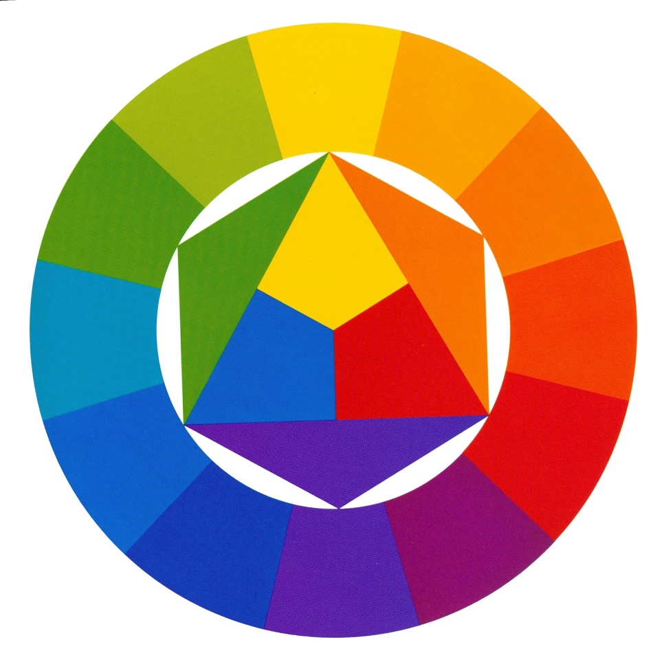
How to get the right color? There are two ways. The first is traditional, using the well-known color wheel:
So, there are primary colors:
- yellow
- blue
- red .
Which when mixed give
- orange
- green
- violet
- brown .
Moreover, the shades of mixed colors depend on the proportion of primary colors. And, using the color wheel, you can get the desired color like this:
- Take a certain amount of the main color (for example, blue )
- Add some second primary color (for example, yellow )
- Compare the result green with what you wanted to get
- Add one or another primary color to correct the shade.
- Or simply take the desired shade of green from a tube jar.
Why does the last point arise? take the desired shade from the jar? Because getting the desired color by mixing the main ones sometimes happens difficult.
In principle, for starters, you can get the desired color using such a color wheel. However, as skill increases, the need for more precise color selection increases. Indeed, with the help of the described principles, it often turns out dirt. For example, it is very difficult to get a good violet color by mixing red And blue. Or is it difficult to get necessary shades green , orange, brown flowers. That is, the principles do not take into account any factors that affect the result when mixing colors.
We are happy to tell you that these factors really exist, and, moreover, with their help you can cope with the problem of “dirt” and still learn how to get the right colors not by intuitive mixing, but by ordinary simple sequence of actions. This sequence and the reasons for the “dirtyness” of the standard color wheel were discovered not by us, but by Michael Wilcox. Who wrote the book " . How to get the color you really need". By the way, you can download this book by Michael Wilcox from the link Blue and yellow do not make green.
Naturally, it will not be possible to present all the material in the book in one article, so we will limit ourselves to the main points, and we recommend getting the details from this very book by Michael Wilcox, “Blue and Yellow Don’t Make Green.”
So, how can you reliably and accurately get the color you want?
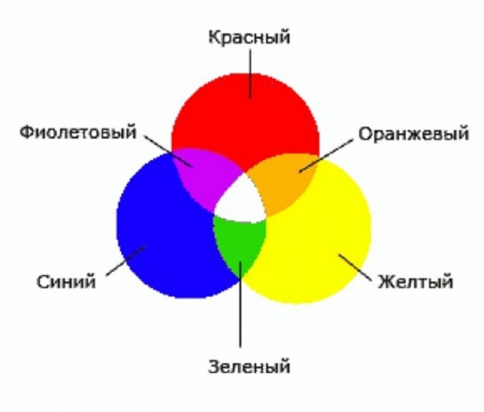
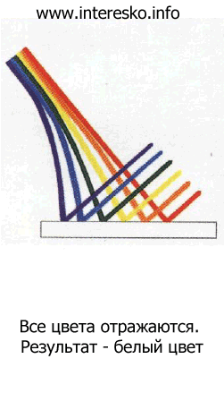
To do this, it is necessary to take into account an important theoretical point. Why do we see color? Because various items(including paint pigment) have different surface, which reflects light differently from the sun or other light source. That is, the surface of, for example, a bathtub, has such a structure that it reflects all colors and absorbs nothing. And all the colors of the rainbow, as we know, form white. Accordingly, the bathtub appears white. On the other hand, the surface of soot has such a structure that it absorbs all the light falling on it. And soot doesn't reflect anything. As a result, we see black soot.
What happens if you mix white and soot? It will turn out beautiful grey color. Why? Because light is reflected from pieces of white completely, as white. And then it is partially absorbed by soot particles. The more soot in the white, the darker the gray it turns out - due to the fact that more and more white light reflected by the white particles is absorbed by the soot particles.
The exact same principle works for color pigments. Thus, red paint is red because it primarily reflects red color. Blue color looks blue, since the pigment in its composition absorbs all colors except blue. It “works” exactly the same way yellow color - the pigment absorbs most colors except yellow.
Next, we move on to mixing colors. So, for example, you take blue paint and red paint. Mix them and get dirt. Why? Because the reflected color is red ABSORBED blue pigment in the same way as all the falling color. Accordingly, the red pigment absorbs all the radiation is blue - because the nature of its surface is designed so that predominantly red pigment is reflected.
But you may ask: “What nonsense, because mixing blue And yellow we still get green, and according to your theory, it should also turn out to be dirt?” Well, if truly pure colors existed in nature, then we would see the formation of dirt. But there is one thing But, which makes it possible not only to mix colors, but also to carefully and reliably select the truly desired shade of color.
So, the pigment reflects more than just light. Light of the same wavelength is reflected in greater least. Thus, the red pigment mainly reflects red color. But nevertheless, all other colors are also reflected (for example, violet or orange). Exactly the same can be said about yellow color - the pigment predominantly reflects yellow, but nevertheless it can be reflected in sufficiently large quantities orange or green. WITH blue same thing - it can carry additional “harmonics” green or purple .
So there is Not three primary colors. Eat six primary colors:
- Mainly reflective paint red and to a lesser but significant extent orange .
- Paint that mainly reflects red and to a lesser (but significant) extent violet .
- A pigment that primarily reflects yellow and in addition green .
- A pigment that primarily reflects yellow and plus an additive orange .
- Mainly reflective material blue and partially violet .
- Material that reflects predominantly blue and partially green .
Well, have you already understood the principle of color formation?
It's very simple: you take yellow from point 3 and blue from point 6, mix these colors. Blue pigment neutralizes yellow, yellow pigment absorbs blue color. What color remains? Right, green! And not just green, but beautiful, bright and juicy green.
In the same way: by mixing blue from point 5 and red from point 2, you neutralize the blue and red colors, and a rich and rich color appears violet color.
And finally: by mixing yellow 4 and red 1, you get orange due to the fact that the red pigment will absorb radiation from the yellow pigment, and yellow will absorb the reflected radiation from the red pigment.
The result was NEW color wheel of six primary colors:

The colors have arrows that indicate the path for optimal manifestation of the “mixed” color. Respectively, variety of shades is born as a result of one or another combination of these SIX primary colors. “Wrong” combinations (for example, blue 6 and red 1) produce dull shades of colors (for example, dirty purple). The combination of one “correct” color and one “wrong” color (for example, blue 6 and red 2) produces more pronounced shades (for example, a brighter purple). And finally, a combination of the "right" colors (for example, blue 5 and red 2) produces a clean and bright color(bright and beautiful purple).
Naturally, reading the article is not enough to master receiving desired color. It is best to read the book " Blue and yellow do not give green» by Michael Wilcox plus do the practical color matching exercises described in the book. But nevertheless, the answer to our question has been received.