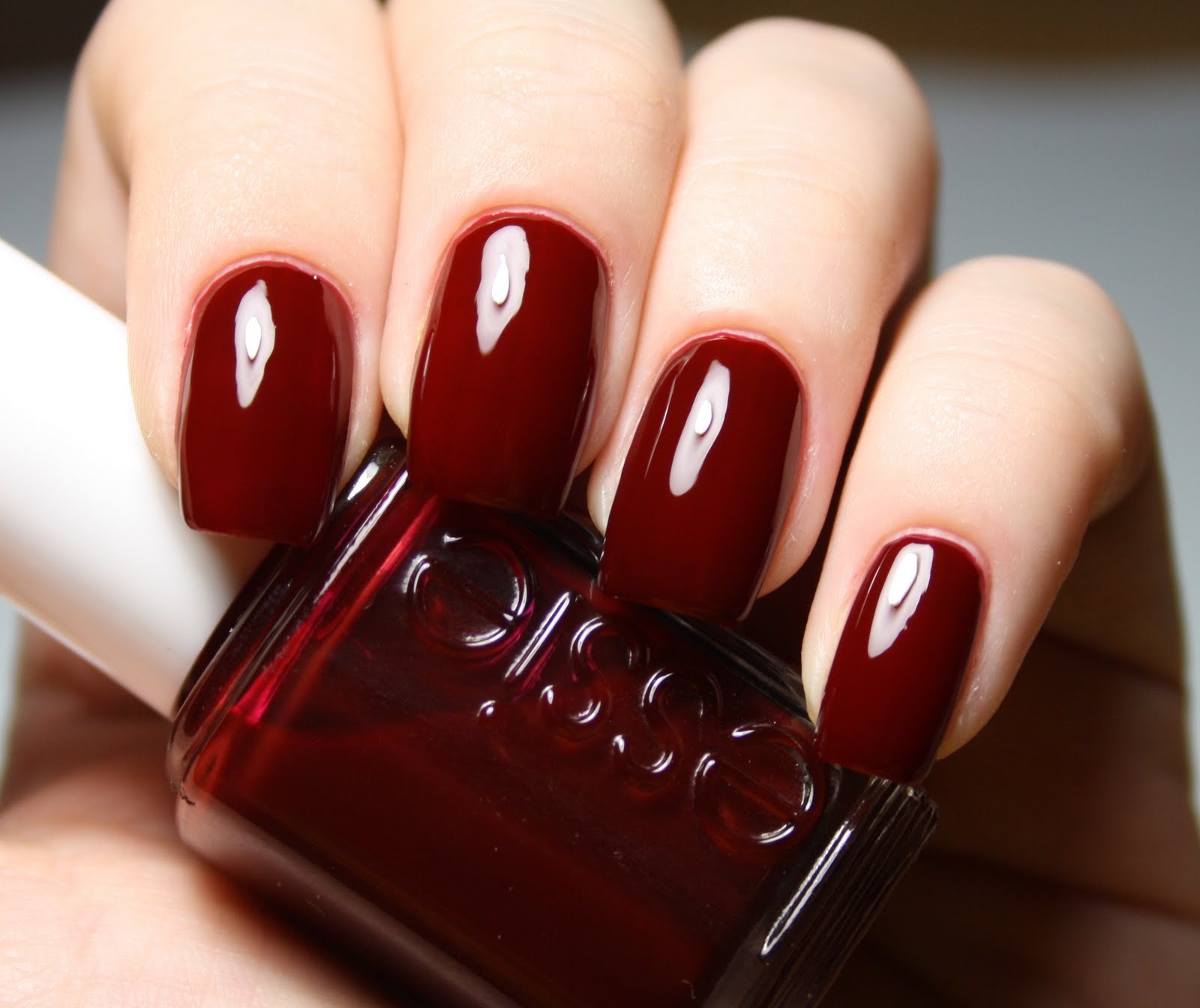
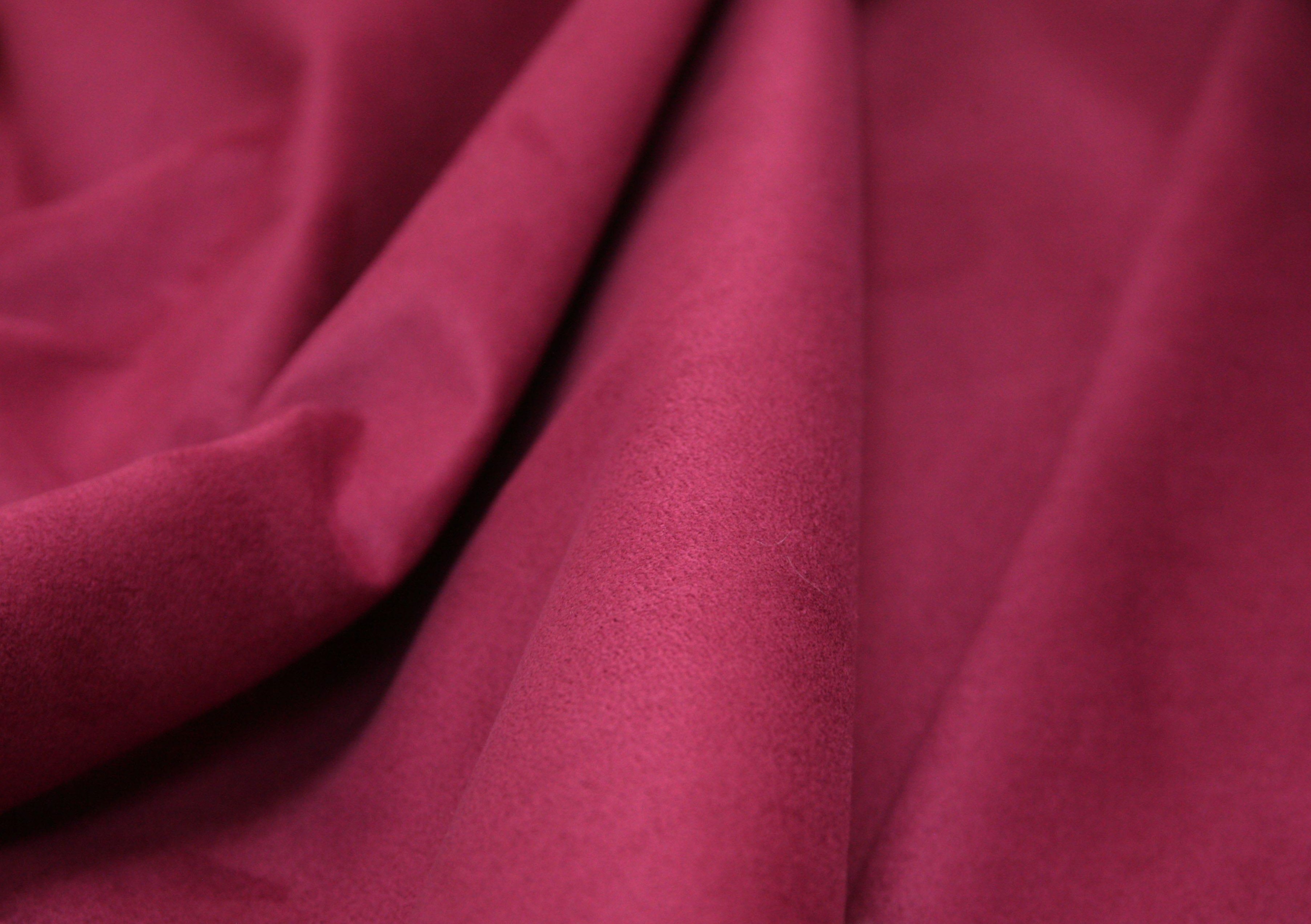
Burgundy color: how to get it when mixing paints? Burgundy color and its features. How to achieve this color when drawing and what shades exist?
Burgundy is part of the spectrum of red shades. When mixing red with brown, blue and yellow we get burgundy different shades: rich tones, light and dark. At the same time, Bordeaux can be both warm and cold. Let's try to understand how to get burgundy color.
A bit of etymology
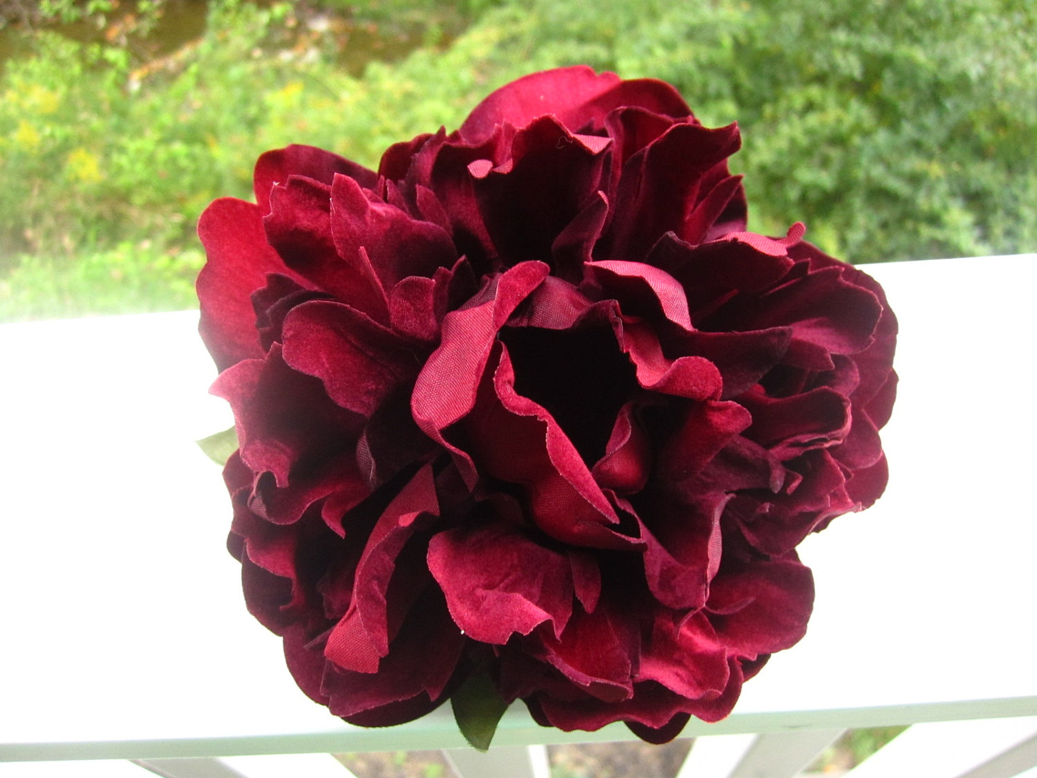
The color “Bordeaux” gets its name from a variety of French red wine. In Slavic etymology it was called “chermny” or, more precisely, “chermny na new”, which meant the best or the best. It is no coincidence that burgundy is the color of triumph, nobility, rich vital energy, and passion. That is why it was often used in heraldry and clothing of emperors of all times, starting with the Romans.
In Chinese philosophy, red shades are used to banish negative energy. It is for this reason that red wedding dresses are sewn for the bride, and red eggs are presented to newborn children.
All shades of red, including burgundy, have magical powers and attract attention. The energy of color increases appetite and pushes people to take risks. Marketers use this successfully. In the casino, this color is used to highlight the sectors where overpriced bets are placed. Restaurants take advantage of this property fast food, often the design contains shades of red, including burgundy.

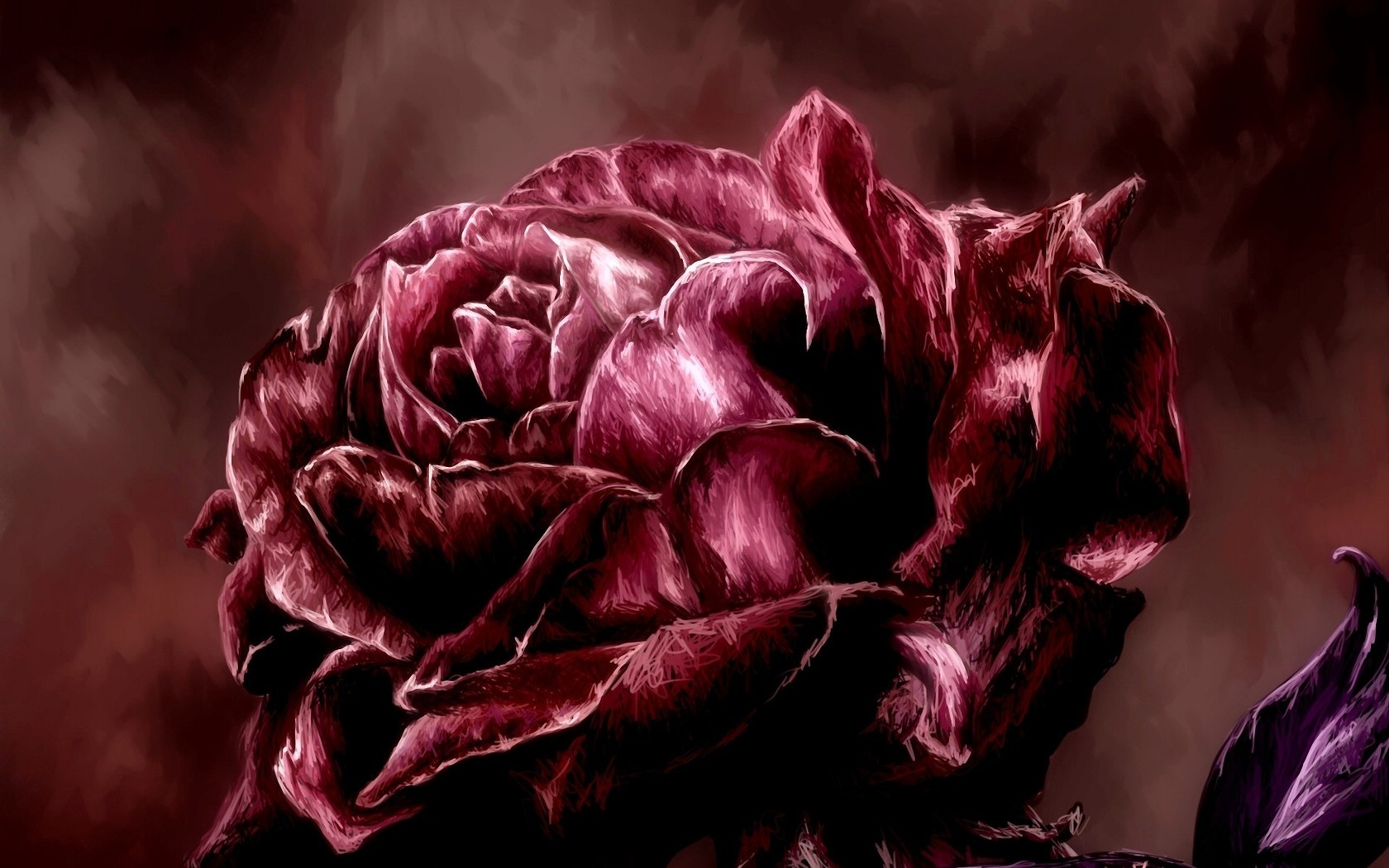
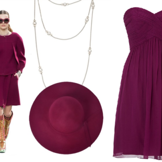
In the fashion industry, Bordeaux is associated with respectability and a certain level of wealth. It goes perfectly with the golden shade. The rich color of burgundy roses and expensive wine in a glass are an entourage of color. It is often used for evening wear.
For people who are prone to risk, it is better to use burgundy color with caution. If you need to attract attention, impress, stand out, emphasize your status, then this is a good choice.

How do you get burgundy color?
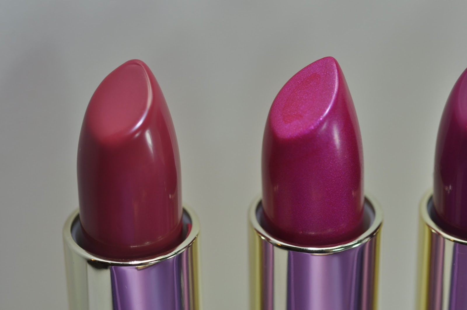
To obtain various artistic paints, ranging from watercolors to stained glass, several colors are mixed. To understand how to get a burgundy color, just take bright red as a basis and add blue to it, the result is a beautiful shade of the same name. Mix in the following proportion: for 4 units of red, one unit of blue.
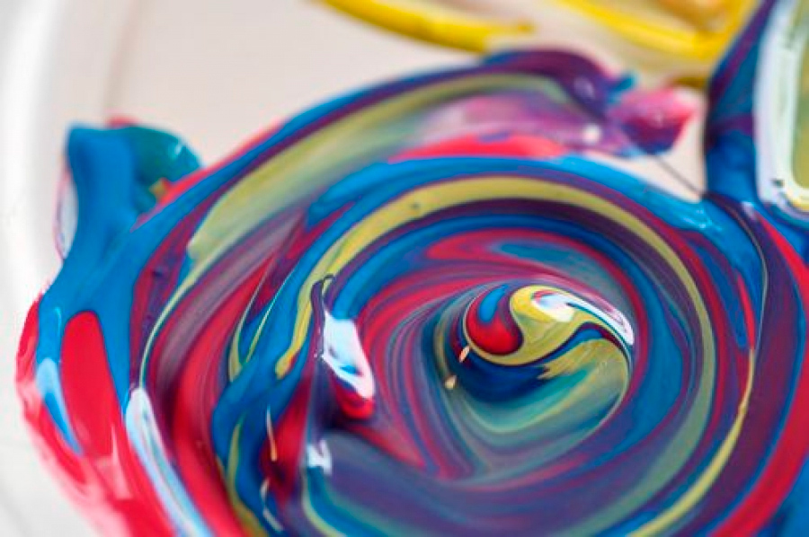
Depending on what shade of red and blue is taken, a different tone of burgundy is obtained. How to make a softer shade? To get a burgundy color with a warm undertone, just add a yellow pigment or use bright scarlet with brown.
How to get more cool color? To do this, simply mix three primary colors: red, black and brown. Since the result is a rather rich shade, it needs to be diluted. To do this, add water to watercolors and white paint to gouache.
A pastel light tone of burgundy is called Marsala. It is less aggressive and was noted as one of the most fashionable tones in 2015.
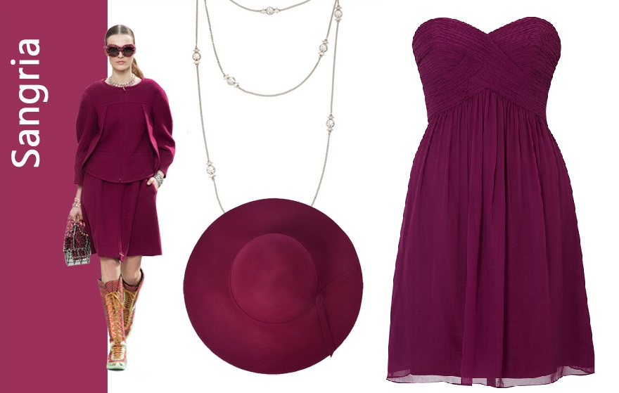
Sangria (derived from the name of the Spanish wine with pieces of fruit) is a soft Bordeaux with a violet or lilac hue.
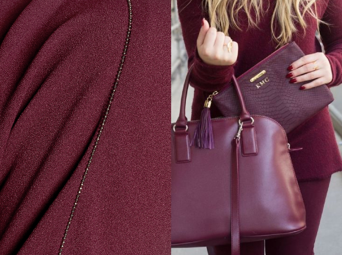
Burgundy is also distinguished - this is a rich dark shade. All these varieties of burgundy are actively used in the fashion industry, and from time to time they are included in the top colors of the season. Clothes in this color scheme look impressive and expressive, with elements of challenge.
Video: how to mix colors to get the desired shade.
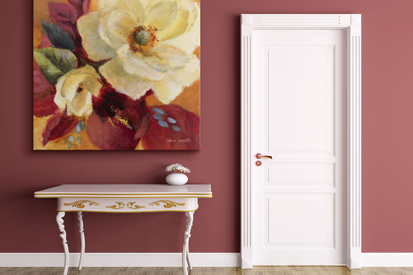
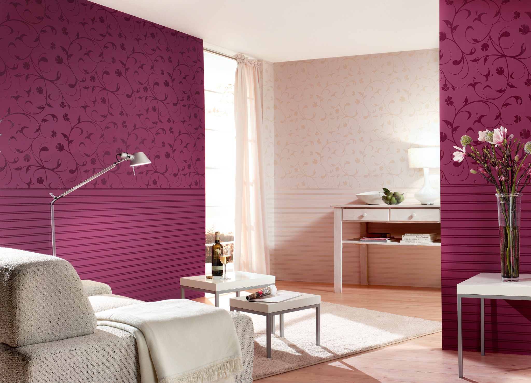
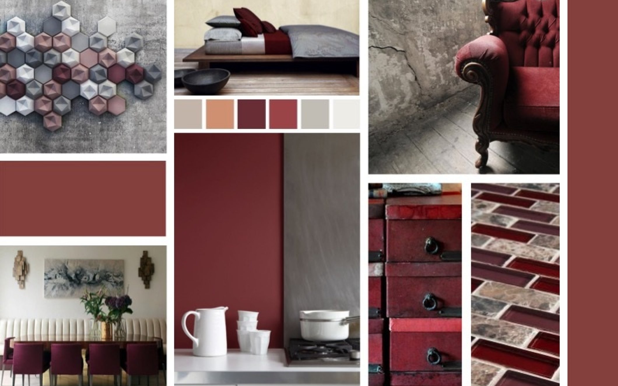
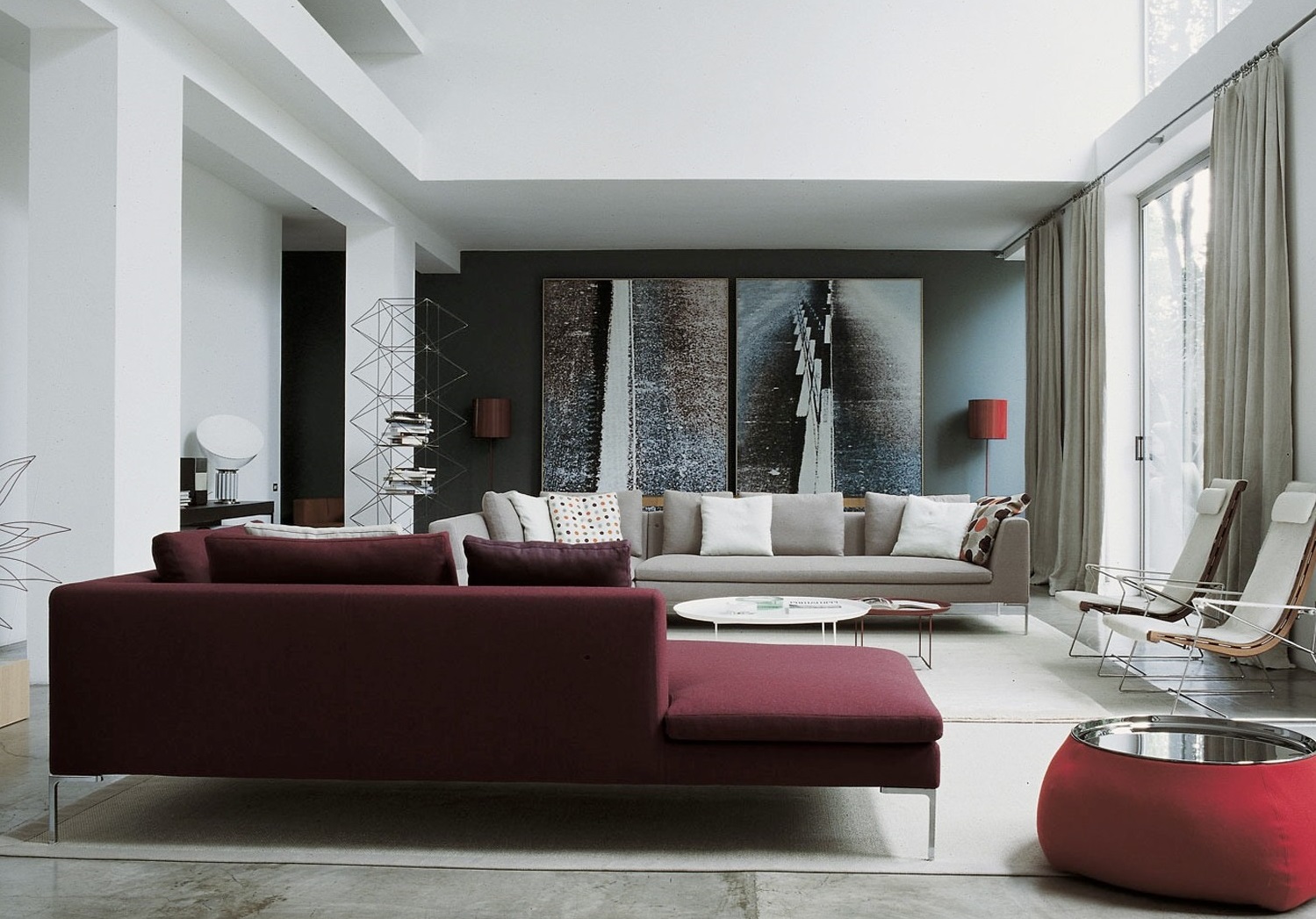
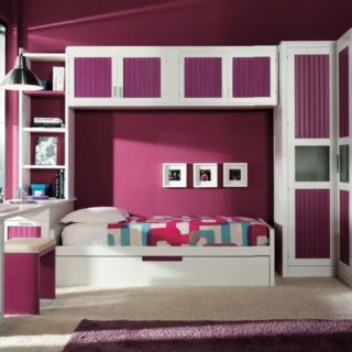
Shades of burgundy in the interior
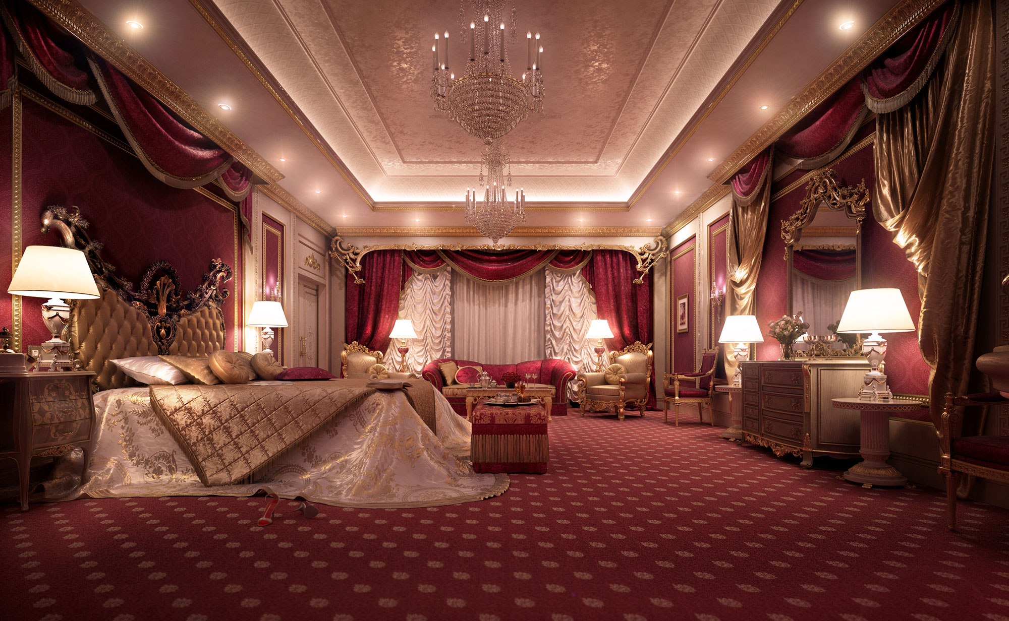
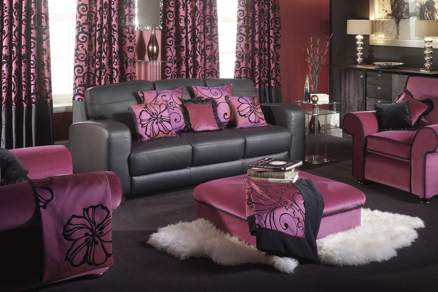
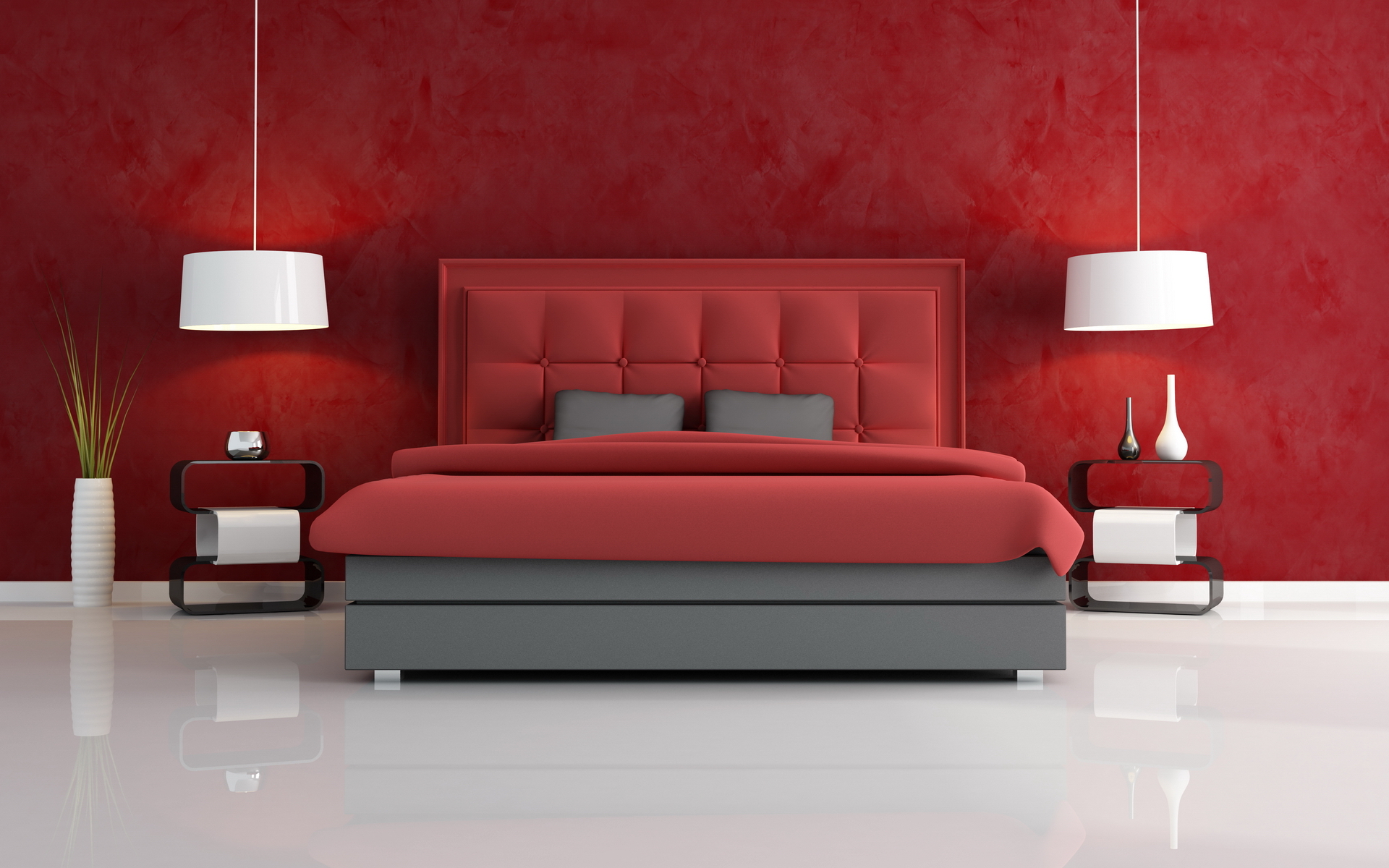
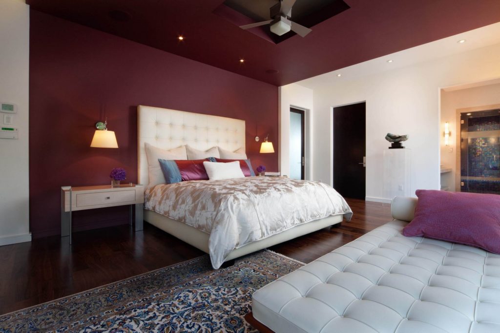
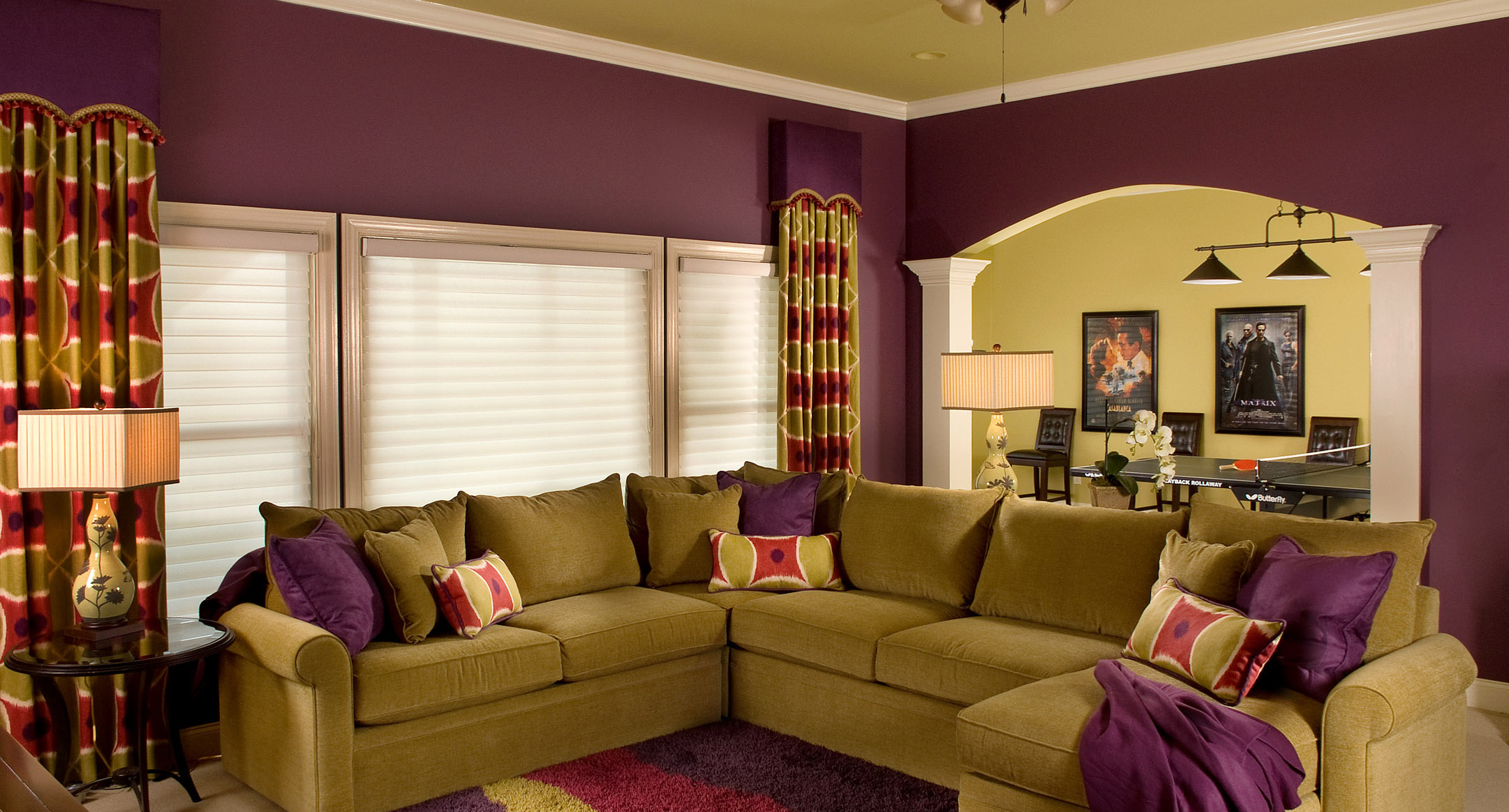
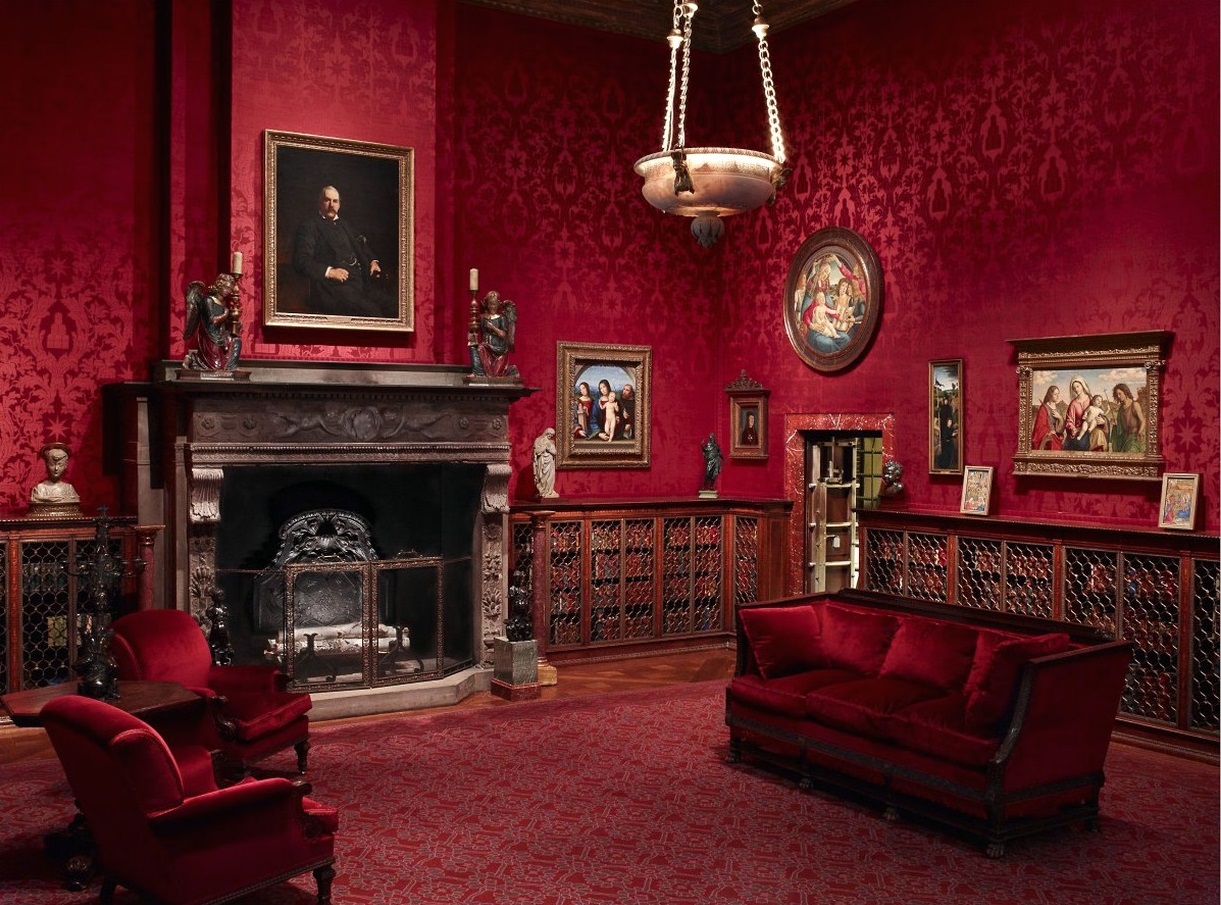
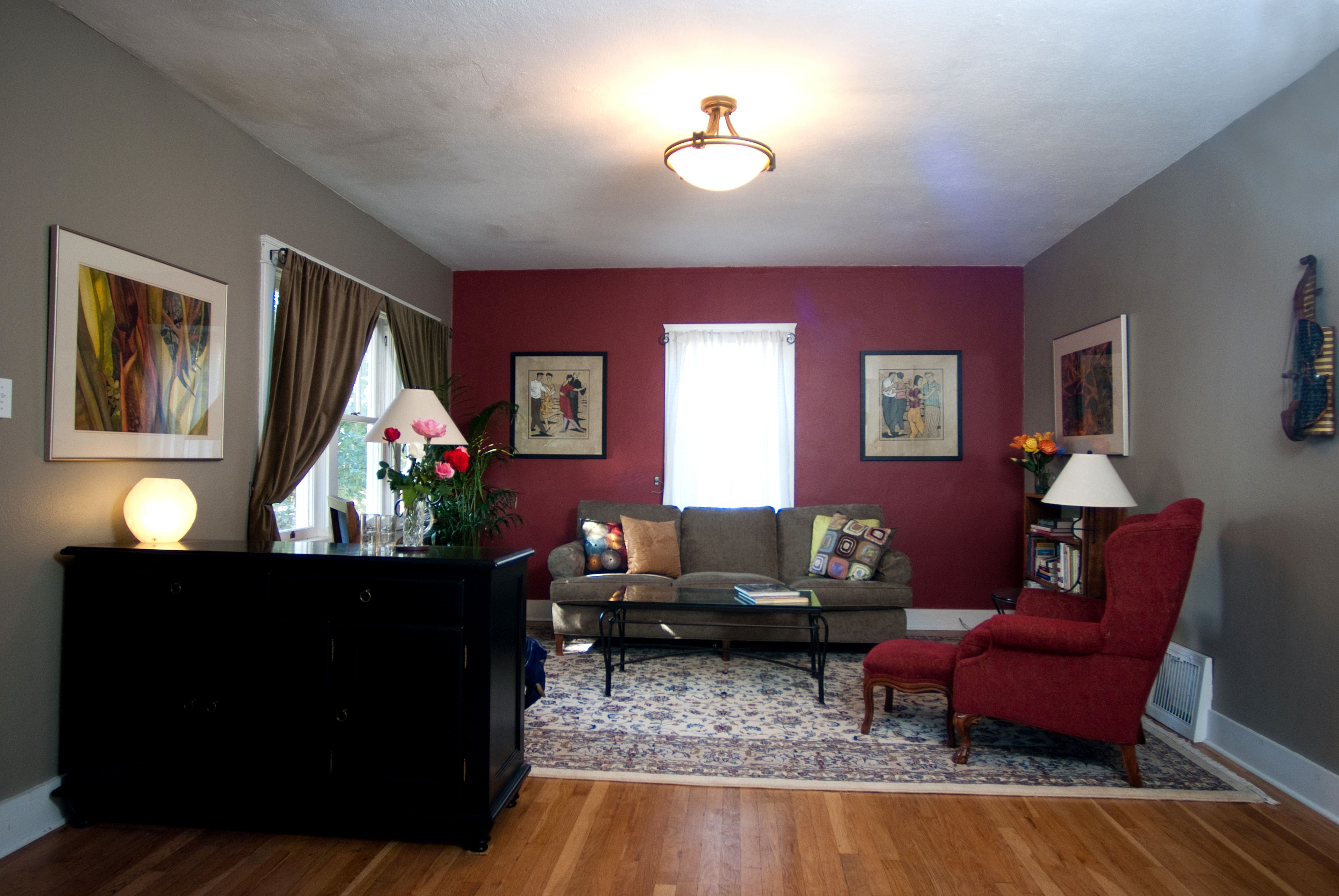
In the interior, burgundy in combination with gold is used for lush classics. You will definitely find this combination in expensive hotels around the world. They have a weakness for him and Arab sheikhs. In a minimalist style, as a rule, burgundy is the accent tone.
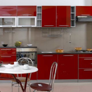
Terracotta color is especially popular. It is softer and more pastel, so it is suitable for use in all styles. It goes well with all light tones. For example, in the living room, where beige color, it is appropriate to use terracotta to highlight certain areas for upholstery upholstered furniture, curtains on the windows, sofa cushions.
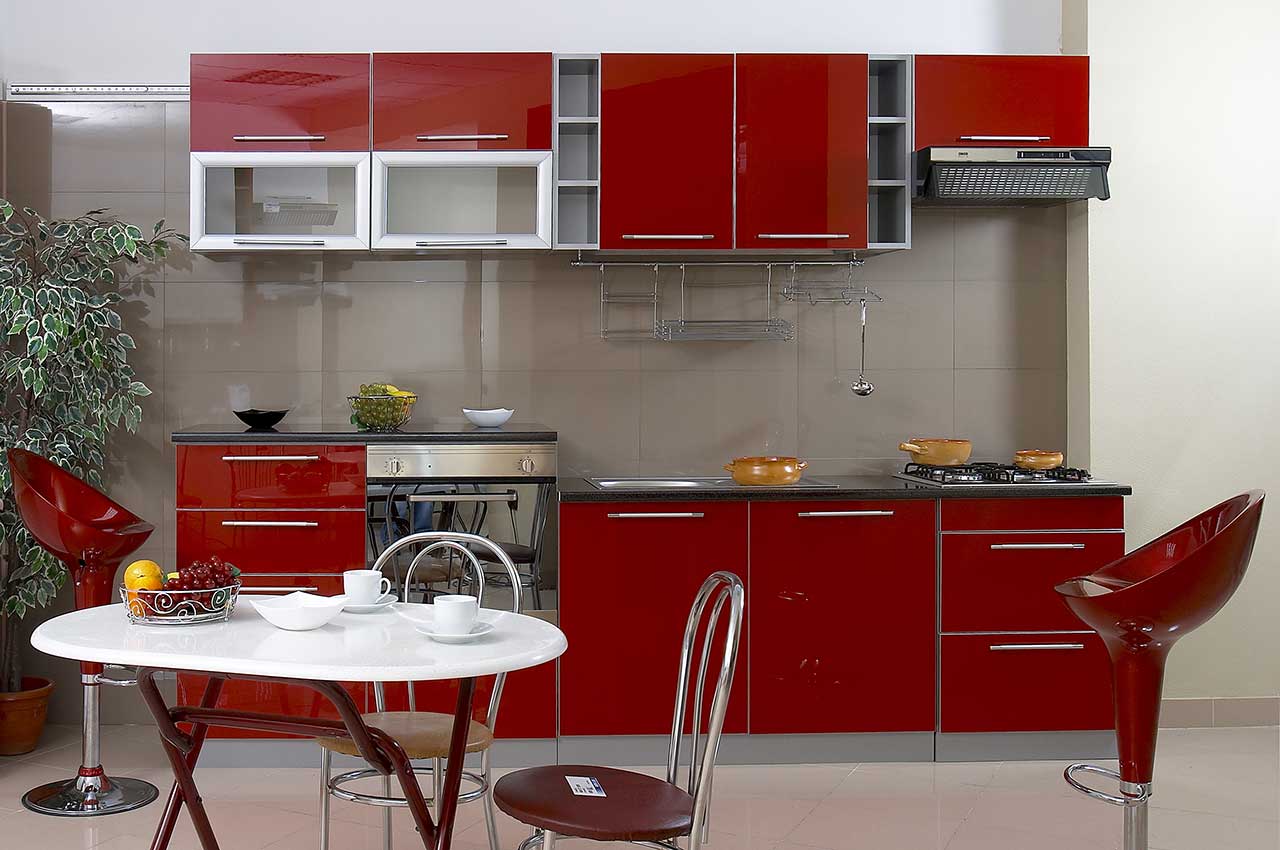
A kitchen furniture set with combined white, coffee, beige and terracotta facades refreshes the interior.
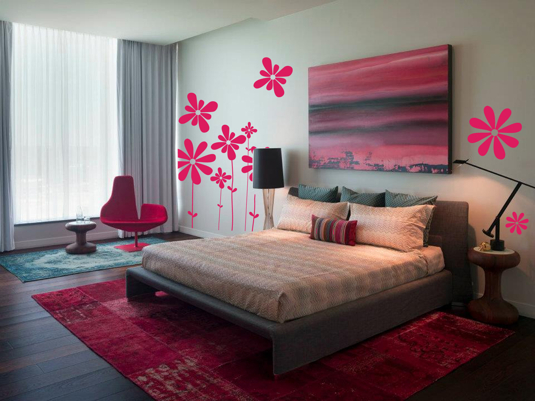
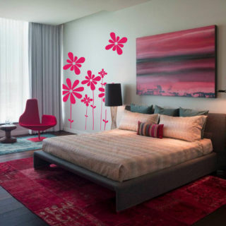
Sangria fits perfectly into the interiors of bedrooms and nurseries for girls. This color for textiles is appropriate in the bedroom. In a room for little princesses, it can be used in combination with white, for furniture facades, textiles. It will be an alternative to the already familiar pink. In addition, sangria is a more “grown-up” color, so there will be no need to change the decor later when the girl grows up.
![]()
Shades of burgundy are also used for room decoration. Reproductions, paintings, wall painting Using these expressive tones, they fill the room with energy and stand out against a neutral background.
Bordeaux (a derivative of red, blue and brown colors) – one of the most expressive shades. Its emotional and energetic intensity requires balanced use.
A couturier must have refined taste in order to masterfully use the burgundy color in his collections. The interior designer competently and carefully places accents with it. Only in this case the color will sparkle.
Beautiful color combinations (1 video)
Different shades of burgundy (36 photos)


![]()


In painting it is required large number different colors and their shades. By mixing certain colors in different proportions, you can get almost all color scheme. The only exceptions are yellow, red and blue - they cannot be obtained, and they are considered basic.
How to make green
When mixing blue, cyan and yellow paint in equal proportions, we get green.
In order to get different shades of green, you need to mix certain colors.
- Light green - mix yellow with white and green.
- Olive - mix green, yellow and add a little brown.
- Coniferous - mix green, yellow and add a little black.
How to make purple
To get purple, you need to take red and blue in equal proportions. You can learn more about how to properly mix paints to get purple in the article.
To get different shades of purple, such as lilac, mix red and blue in different proportions and add a little white paint. In order to get the desired shade of lilac, you need to experiment a little.
How to make pink
Get pink very simple. It is enough to mix red and red in equal proportions. white. To get a richer pink, add less white paint.
How to make gray
Various shades gray can be made by mixing black and white colors in various proportions.
How to make blue
To get blue, take blue and white paint. We mix them in equal proportions, and to get different shades of blue, we change the proportions of white and blue each time.
How to make beige
To get a beige color, you need to take brown and gradually add white to it, then add yellow for brightness.
How to make orange
You can get orange using red and yellow. The more red you add, the brighter the color will be.
- The color ocher is considered close to orange. It can be obtained by mixing yellow and brown.
- Another popular color is terracotta, which is obtained by mixing orange and brown.
To get brown, refer to the article.
How to make turquoise
To get this color, you need to take blue and green and mix them in equal proportions. And to get various shades of turquoise, you need to add a little white.
How to make burgundy color
There is a huge range of shades of burgundy. So:
- if you want to get a cool burgundy, then add a little blue to the red. But don't overdo it, or it will turn purple.
- if you need a warm shade, add a little yellow to the red.
Burgundy color(or burgundy color) refers to shades of red. This is the color of French red wine from Bordeaux - a rich, warm dark red. Burgundy is also a shade of purple, a natural dye obtained from certain types of Mediterranean shells. Since ancient times, it has been used in heraldry and was considered the color of emperors. It symbolizes dignity, strength and power, authority, supremacy and dominance; piety, moderation and generosity.
You will need
Palette;
- red paint;
- dark blue paint;
- yellow paint
Sponsor of the placement P&G Articles on the topic "How to get burgundy color" How to mix paint colors How to pack flowers How to weave a wide bracelet from beads
Instructions
You can get burgundy color by mixing several colors. The classic shade of burgundy in the perception of Russians is considered to be a shade of burgundy, composed of bright red and dark blue, with the addition of a small amount of yellow paint, which gives the color warmth. This combination is relevant for all types of paints - watercolors, gouache, tempera, oils, various types fabric dyes, stained glass paints. If you work with these materials, then you need to mix the paints on the palette in the required proportions.
Take some red paint onto your palette, then gradually add dark blue paint to it. As a dark blue component, you can use paints in the colors of Prussian blue, dark indigo, and ultramarine. Achieve a shade intermediate between red and purple flowers. Proportionally, this color consists of about three parts red and one part dark blue.
To give the color a characteristic warm shade, add warm paint to the mixture obtained on the palette. yellow. There shouldn't be much of it. Focus on your color perception: the resulting color should be quite rich and deep, not dirty. Don't turn the color brown. The red tint in burgundy color should be predominant.
A mixture of red and black paints can also be used as a burgundy color option. The proportions will be approximately the same as in the classic combination with dark blue.
If you do computer graphics or make layouts of printed products on a computer, then to get a burgundy color you need to set it to color palette graphic editor the following values for primary CMYK colors: C (blue) - 30; M (magenta) - 100; Y (yellow) - 70; K (black) - 15. Or the second option for combining process colors: C - 0; M - 100; Y - 100; K - 31. The last combination is more typical for the color perception of Western people and this is how burgundy color is designated in Western color catalogs.
How simpleOther news on the topic:
Crimson is usually called a color between red and pink. This calm, noble color is associated with such lush historical styles like Baroque, Empire and Renaissance. You will need - a palette for mixing paints; - paints; - paper; - brushes. Sponsored by P&G Articles
To obtain the desired paint color, it is not necessary to contact specialists - you can do it yourself. You need to know a few mixing rules and practice a little. Sponsor of P&G placement Articles on the topic "How to get desired color paints" How to get lilac color How to mix
Both in art and in the interior, burgundy color looks very noble. It is appropriate for any occasion and is often used to decorate rooms at special events. This color came to us from France. This shade of red was named after a wine from the province of Bordeaux.
Can this shade be achieved by mixing certain colors?
Many novice artists think about how to get burgundy color when mixing paints. This is quite easy to do. You need to take red, yellow and blue colors. They are basic and are present in any drawing kit. In order to get a noble shade of burgundy, you will need about three parts of a light red shade, one part of a muted blue color and just a little yellow. This will be quite enough.
There is another way to obtain burgundy color. To do this you need to take scarlet, brown and dark red paints. If you mix them, you can get a warm and slightly muted shade. To achieve a cooler color, just add black, dark brown or dark blue when mixing. This will eliminate the warmth, and you will get an aristocratic cold burgundy.
Are there many shades of burgundy?
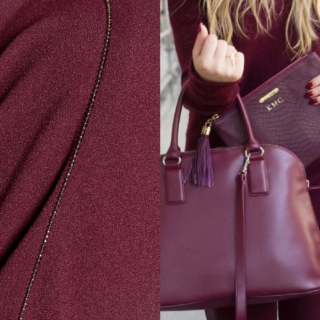
This question can definitely be answered in the affirmative. The color burgundy is used today both in clothing and in interiors. And if we talk about the first case, then every fashionista will be able to choose a shade to suit her taste. Warm and bright variations of this color will suit passionate and confident women. You can wear this outfit to a special event or a social party. Of course, if you combine items of clothing correctly, burgundy can also be used in everyday looks. By using this color in your clothes, you will always look elegant and stylish, regardless of the circumstances.
For men and girls who are calmer in nature, muted shades of burgundy will suit them. These colors can be pink or blue. The most important thing to consider in this case is that it is better to dilute burgundy with calm and neutral tones. Clothes in these colors are perfect for creative and mysterious individuals who want to emphasize their mystery. Also, burgundy color can be used in evening dresses when going to the theater or restaurant. Currently, models on the catwalks advertise this color very often. Therefore, you can without a doubt wear a burgundy dress to a celebration. It is best to combine it with neutral jewelry that will not attract attention.

Color combination: burgundy and white
Combining colors is a rather complex science. If you decide to use burgundy color in your painting, image or interior, then you need to remember a few rules. Burgundy color is quite strong, so it needs a shade that will mute and calm it. This color could be white. Its combination with burgundy is very beautiful and festive, so it is often used when decorating rooms before the New Year.
What other colors can you combine burgundy with?
Burgundy can also be combined with light gray, olive or blue colors. But here you need to be more careful. If you use olive or blue colors as “helpers”, make sure that they are not bright. Auxiliary shades should be pastel and muted so that their combination with burgundy looks harmonious. There is one more trick that will help you look absolutely gorgeous. For example, if you are wearing a burgundy skirt, you can combine it with a blouse of the same shade, but using a light print.
Dark red color in the interior
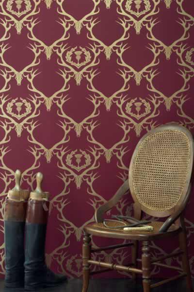
The burgundy color looks great in any interior style. It is perfect for classics, vintage and even minimalism. If your interior is made in classic style, then you can combine this color with gold. This combination is very popular and always adds a certain solemnity to the room. If the room is not very large or is not located on sunny side, then light burgundy wallpaper will perfectly correct the situation. From this we can conclude that this shade of red can be used in the interior of a kitchen, toilet, bedroom and even a nursery. The main thing is to choose the right way to combine it with other colors.